Claire.C

Case Study · 2025-Q2
Manulife Mini Game
CLIENT:
Manulife
YEAR:
2025-Q2
LANGUAGE:
Bilingual
DURATION:
3 weeks
TOOLS:
Figma
Procreate
Overview
A one-off project that was launched for a month at Manulife official website on May 2025. This mini educational game was designed to raise awareness of critical illness and meanwhile targets to attract prospect customers.
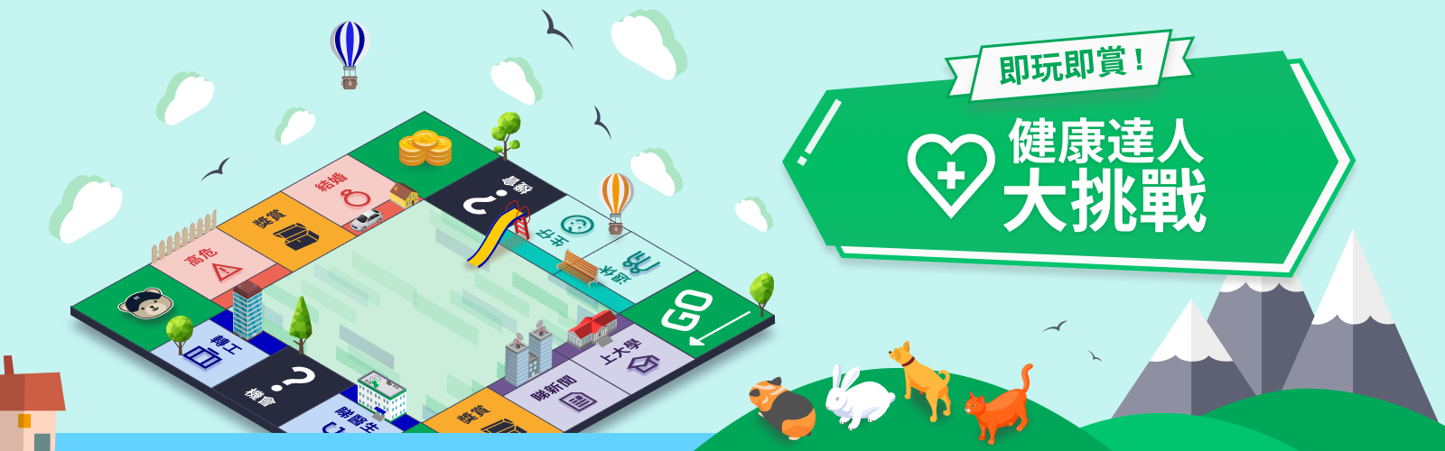
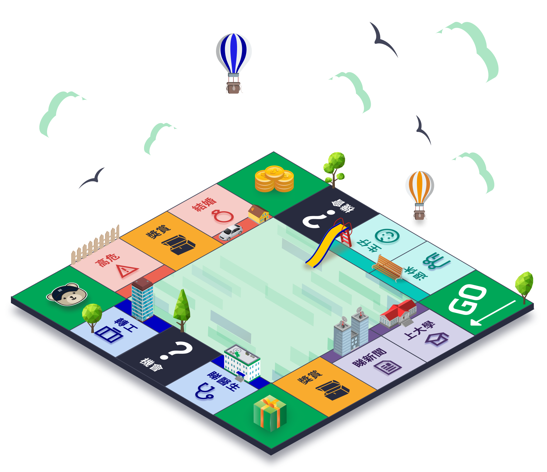
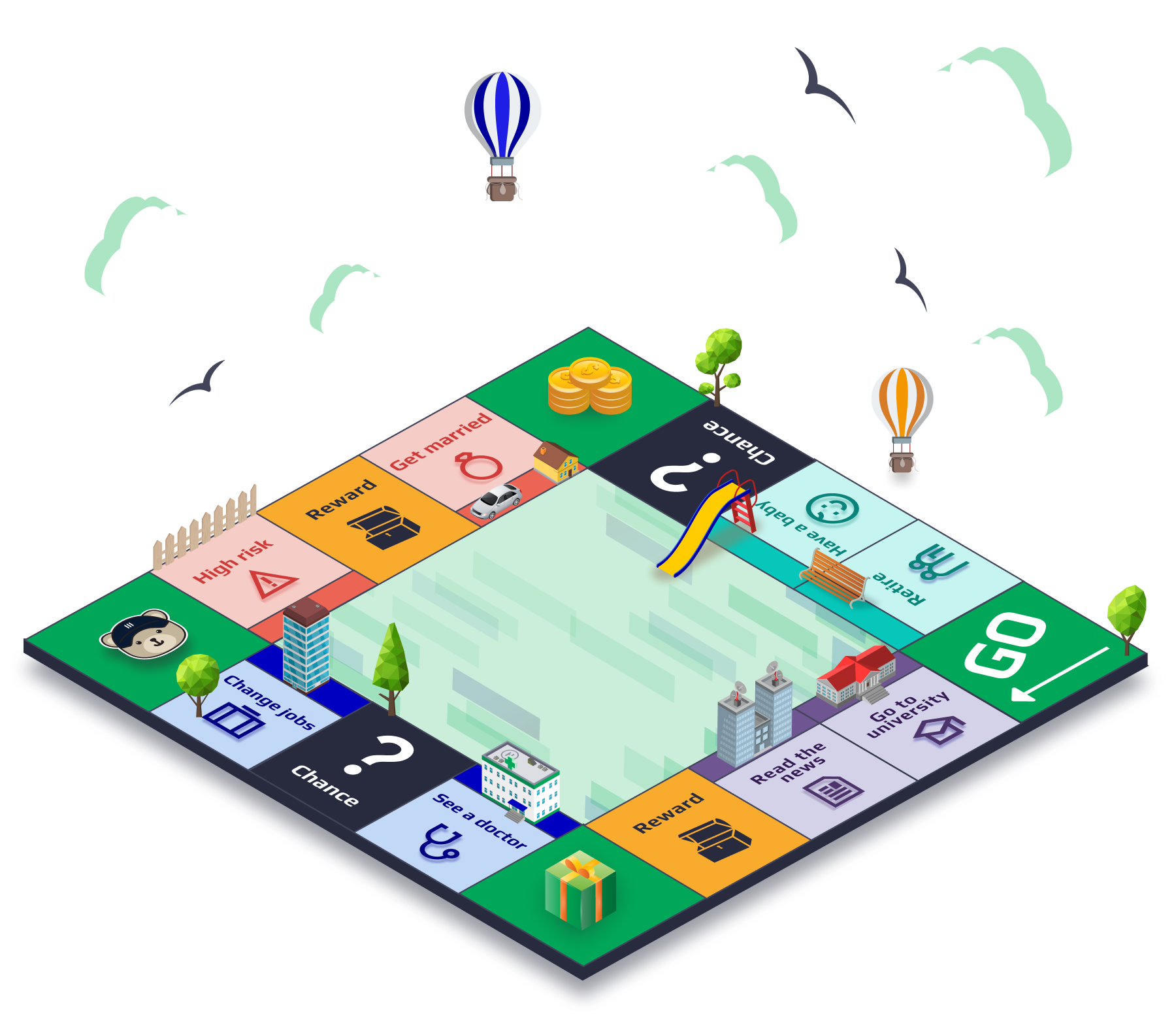
Client had clear idea on making a game that refer to the layout of the Monopoly board game in the beginning, and after several rounds of adjustment, it turns from 2D to a fake-3D design. The final design was delivered within 3 weeks under established UX direction.
The Result
35k+
TOTAL REGISTRATION
5.8k+
Total eligible referral case
My Role
I was assigned to handle this project from end-to-end. Design process were guided according to PM’s brief and client’s comments. The UX were determined by client, therefore my role was to participate in UI design. I used Figma for most of the work, where the chess pieces were illustrated using an iPad app - Procreate.
The Challenge

Time limitation between each design sprint.
Turning 2D gaming board into angular perspective.
Add-on task on designing 4 chess piece, two perspective each.
Process
From sketch to
fake-3D board
Four iterations from the client’s early sketch to the final fake-3D game board —
each shaped by feedback, and by a growing scope.
01
Initial conceptual idea from client:
The project began with a simple conceptual direction from client. The early screens featured a minimal interface with the Manulife logo, the challenge title, a prominent “GO” button, and dice as the core interactive element.
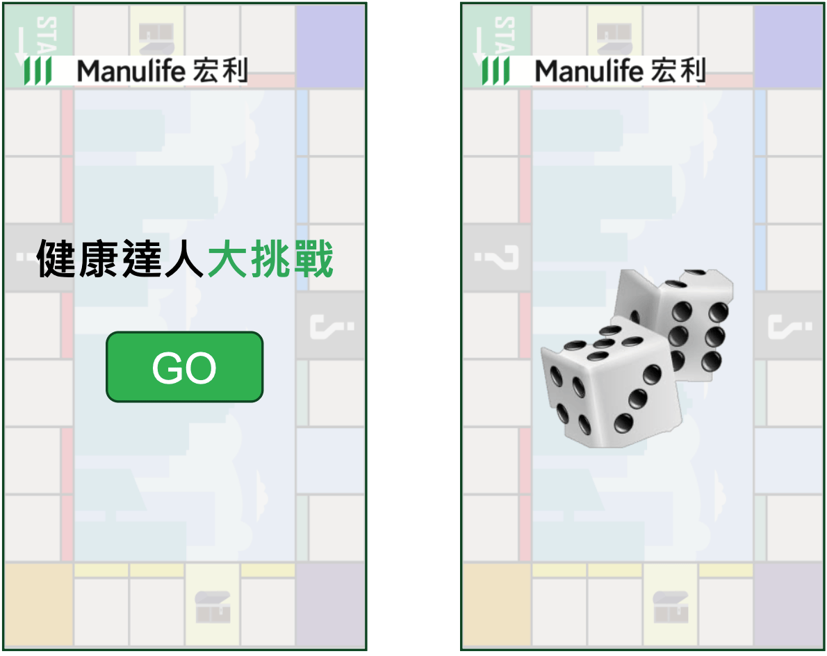
Key observations

The game-like experience was driven by chance (dice rolling).
The visual direction was still very basic, with limited hierarchy and almost no board structure.
Brand presence was there, but could be more prominent.
Design decision in this stage
Understanding the user journey (start → roll → progress on a board), and turn a simple dice-rolling mechanic into a more engaging, brand-aligned experience.
02
Layout 1.0
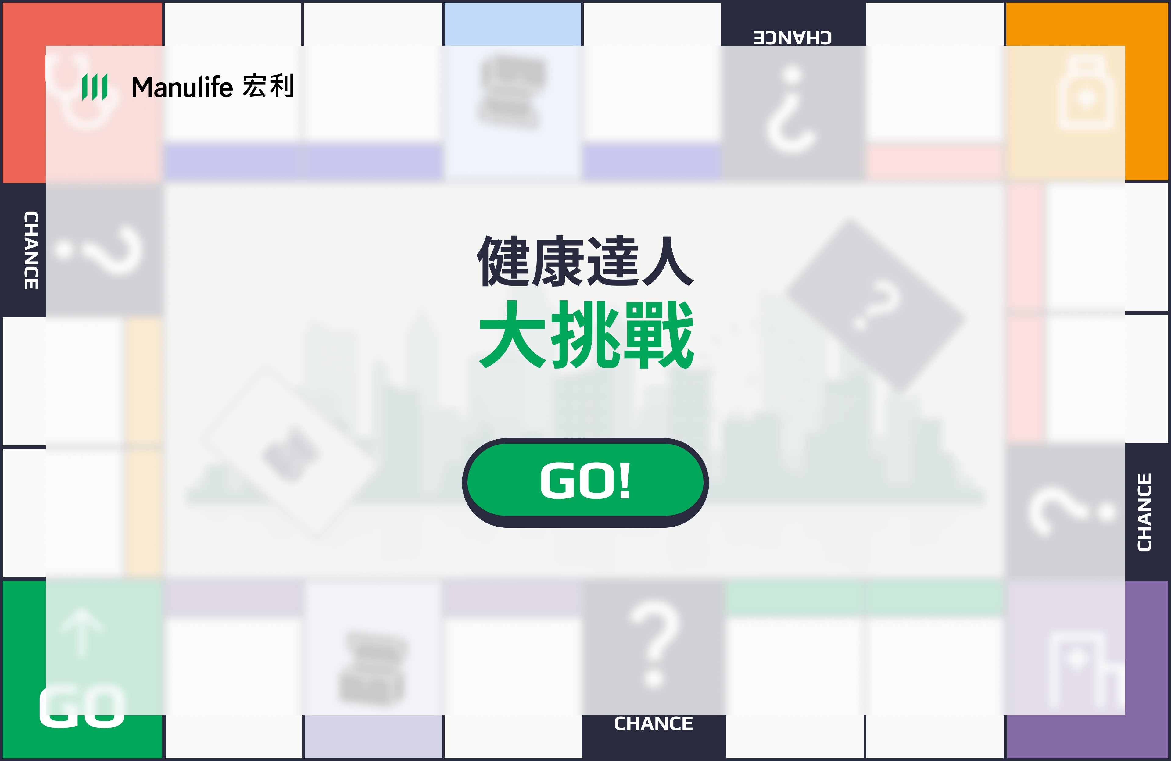
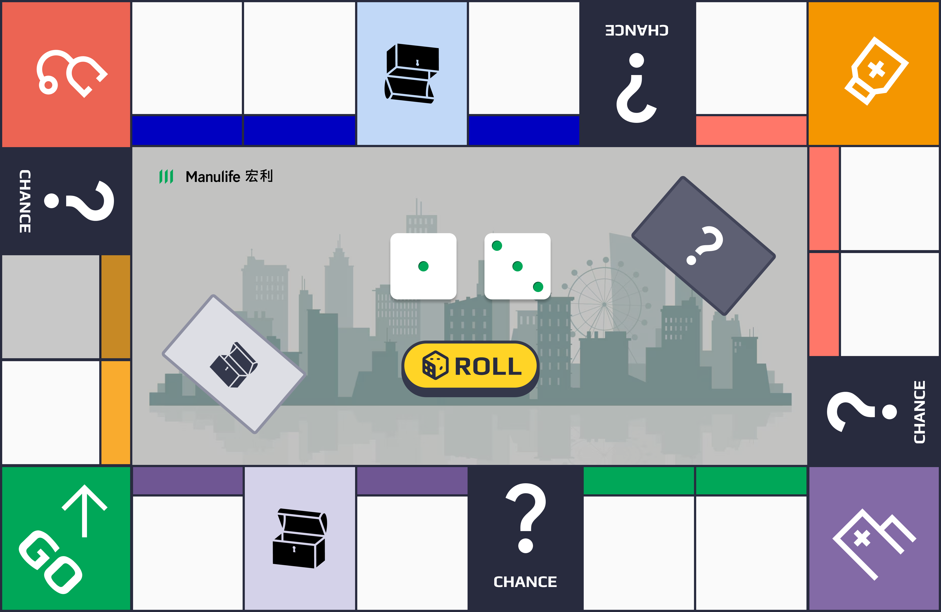
I translated client’s concept into a more structured game board format. The design introduced a recognizable board layout with a central “GO” area, dice rolling interaction, and basic color-coded squares.
Key design decision
Moved from a simple landing screen to an actual board structure to better support game theme.
Established a clear starting point (“GO”) and basic path logic so users could immediately understand how to progress.
Kept the visual language relatively clean and functional at this stage.
Visual richness and character elements were intentionally limited at this stage. The priority was to validate the core game loop and information hierarchy before investing in more detailed illustration and branding.
03
Layout 2.0
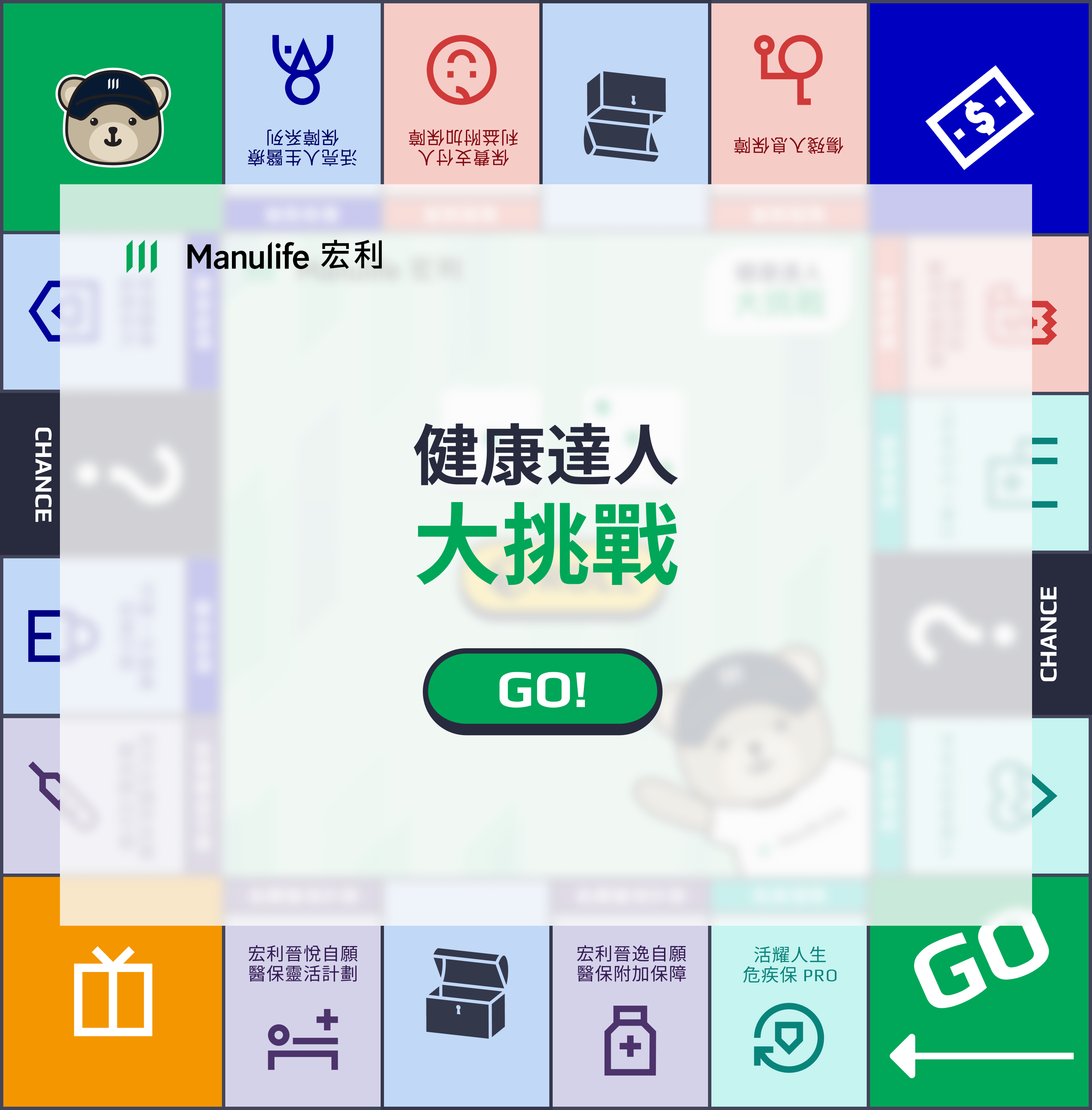
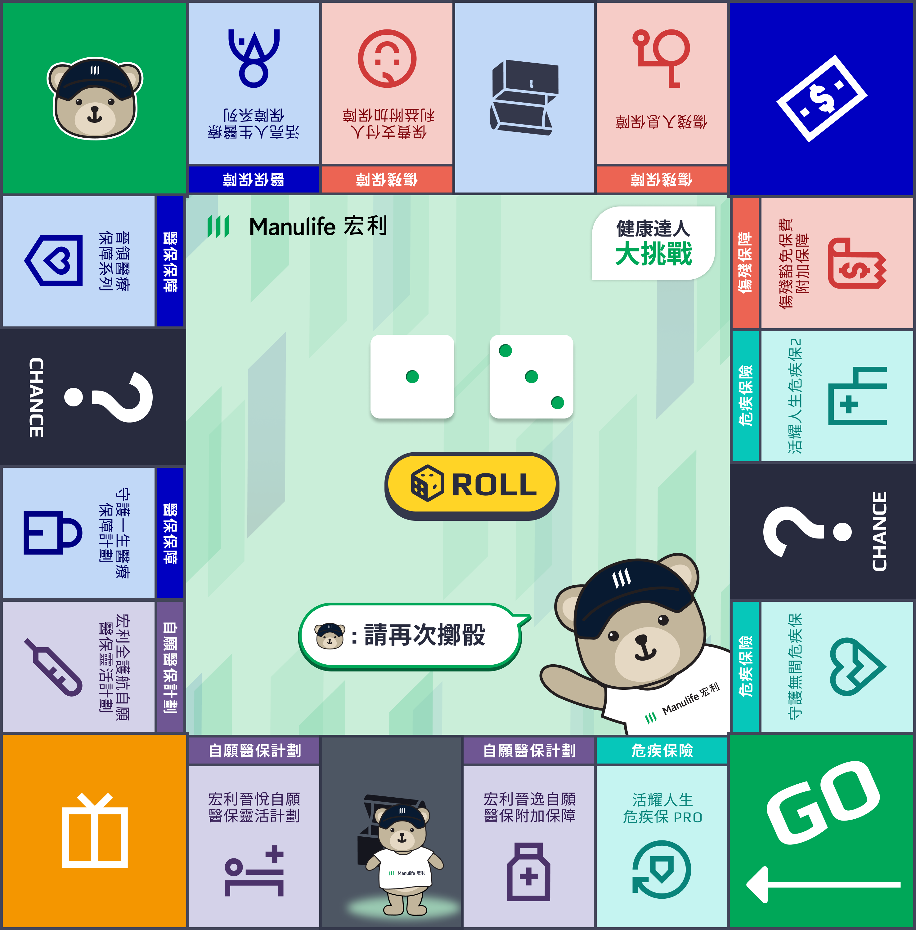
This is a significant step forward in both visual density and engagement. The board became more vibrant, with richer iconography and a clearer colour hierarchy of different event types.
Key design decision
Redesigned the board from a rectangle to a square, so it would work better on both desktop and mobile.
Expanded the event squares (rewards, chance, risks, and more).
Strengthened hierarchy through colour, icons, and spatial organisation.
04
New ideation from client to final version

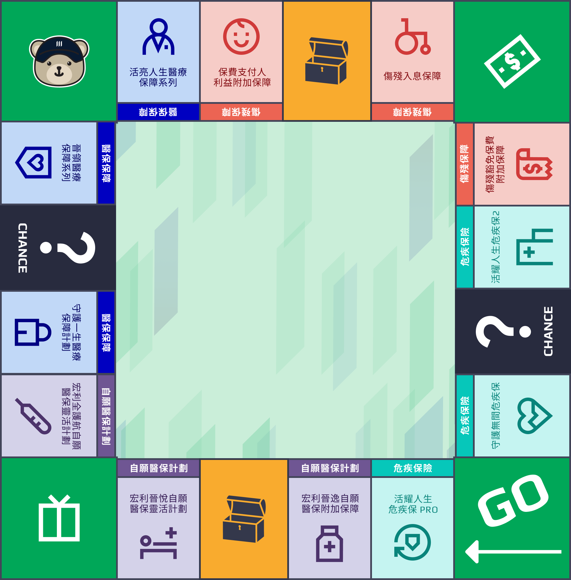
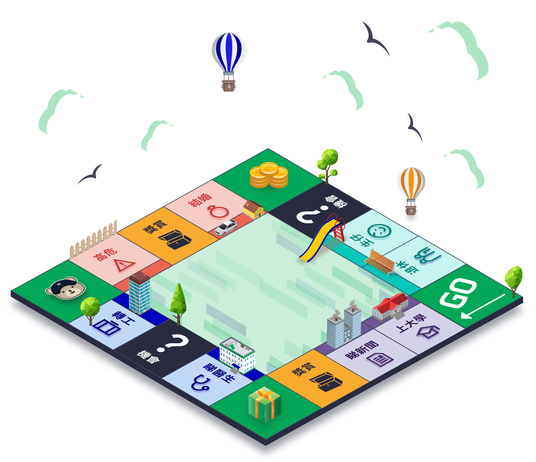
Midway through the process, the client introduced a more narrative direction, and asked to turn the 2D board into a fake-3D angular perspective.
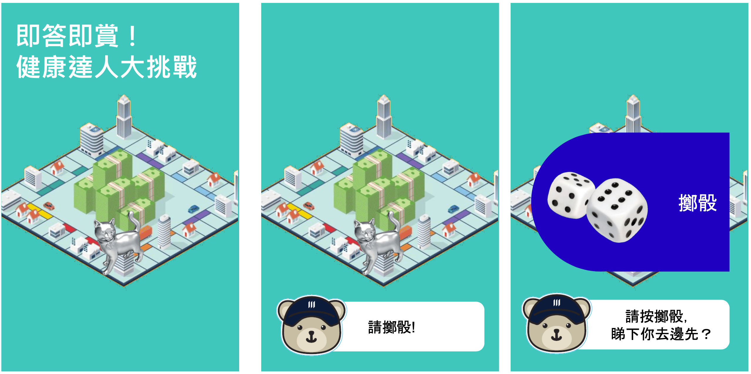
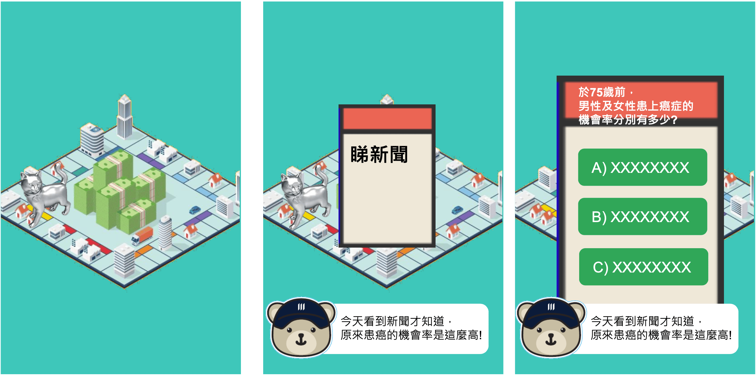
Transformation: 2D board → isometric 3D board

Final design decision
Evolved the board into a clean, well-organized square layout with clear event categories and strong visual distinction between square types.
Developed a high-quality 3D isometric illustration of the board. This elevated the overall brand perception and created a memorable, premium visual that could be used for marketing and immersion.
Playfulness balanced with clarity, so the experience stayed easy to understand.
Delivery
Final UI
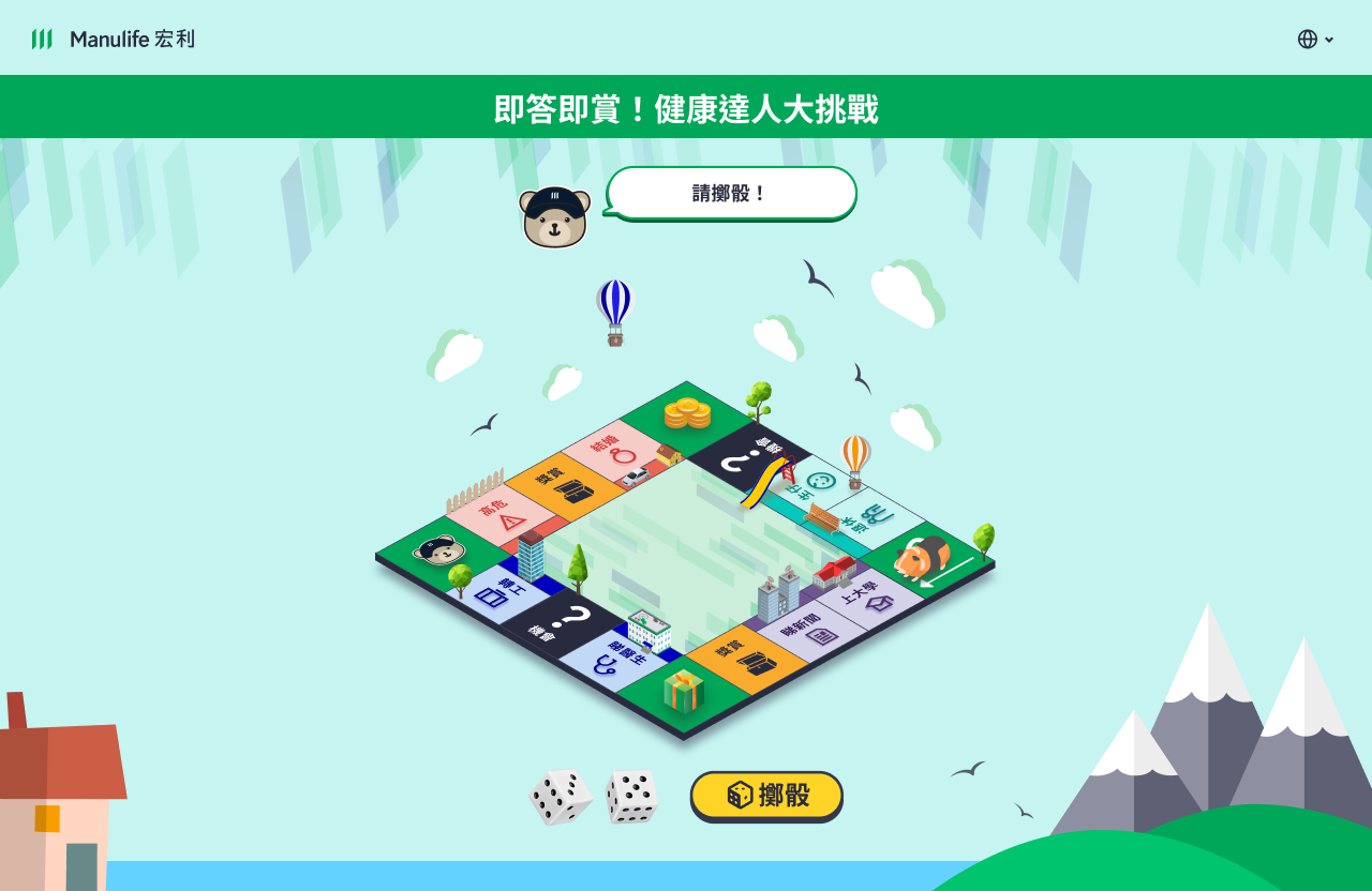
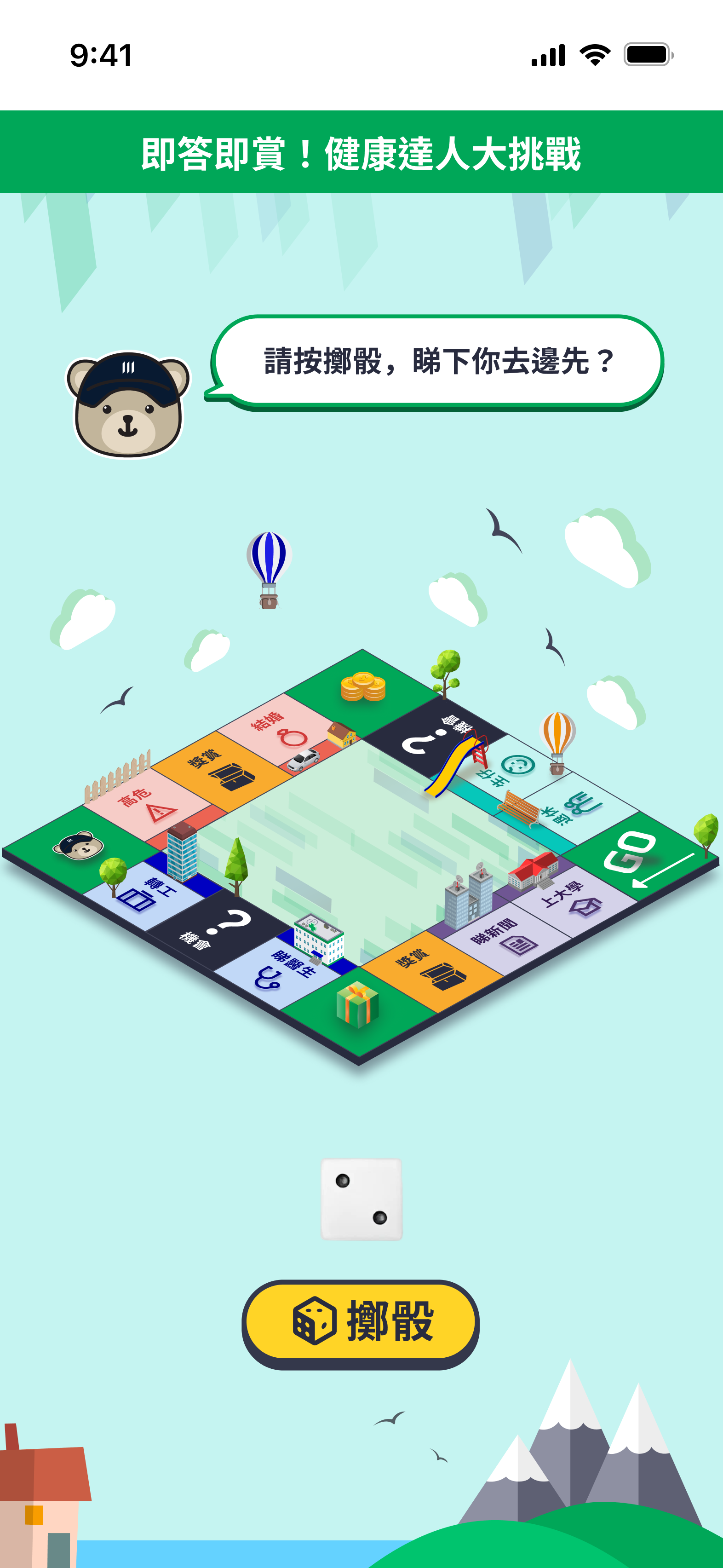
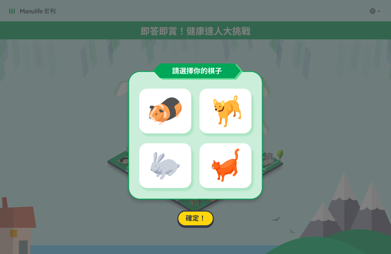
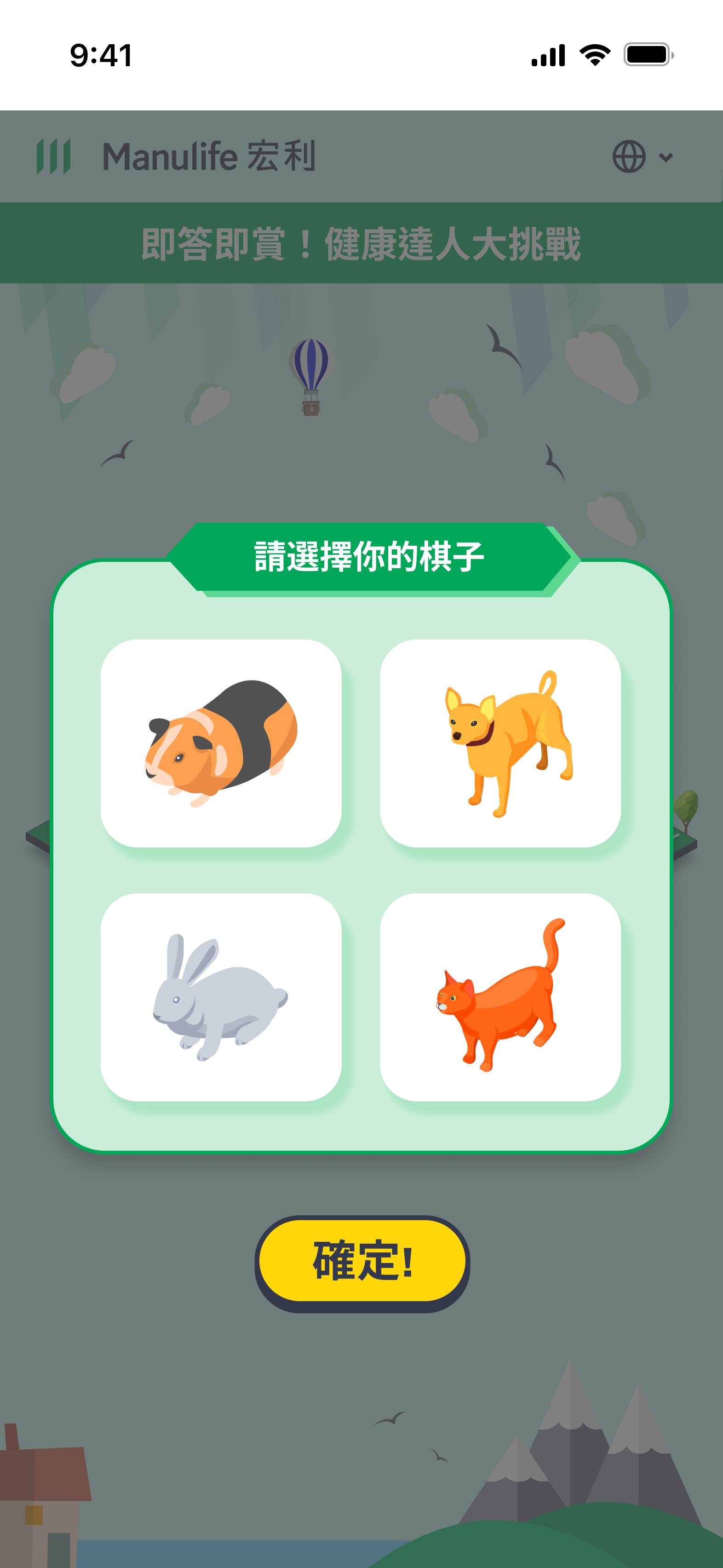
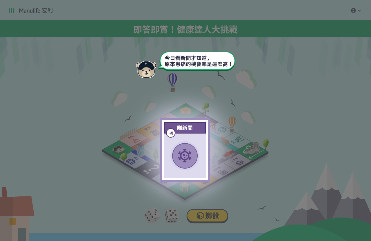
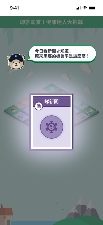
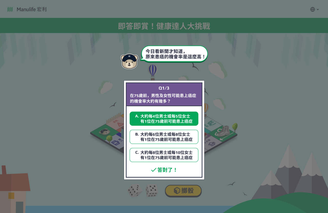
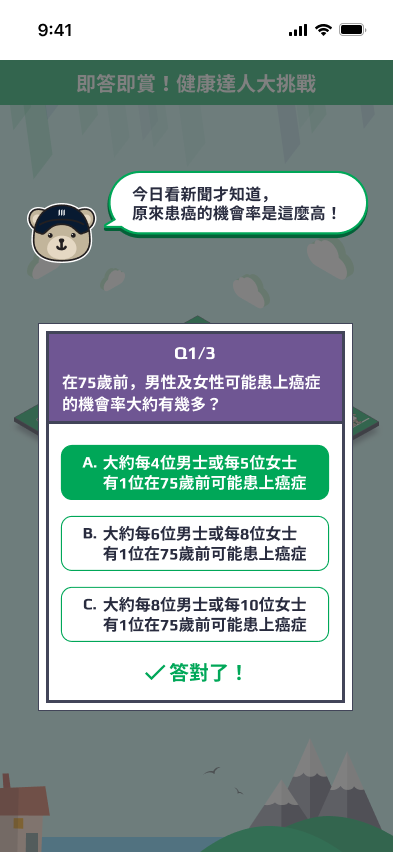
Bilingual UI across tablet and mobile: game board, character select, event cards, and quiz.
demo video
Screen recording
visual craft
UI Highlight
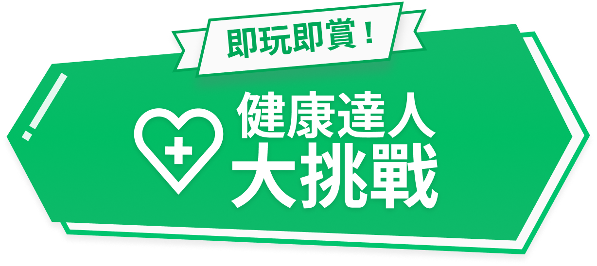
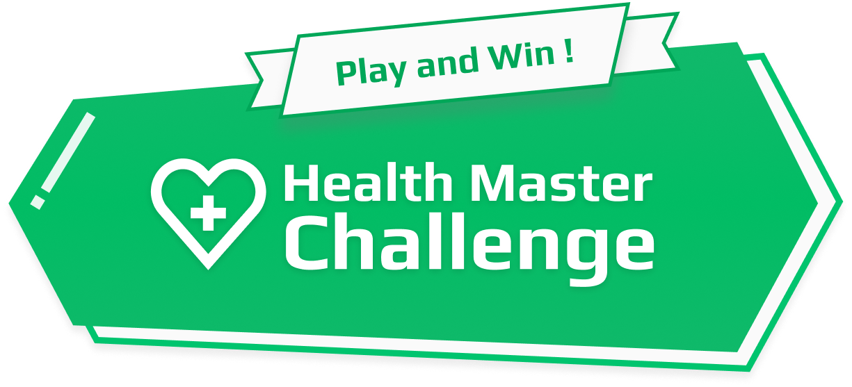
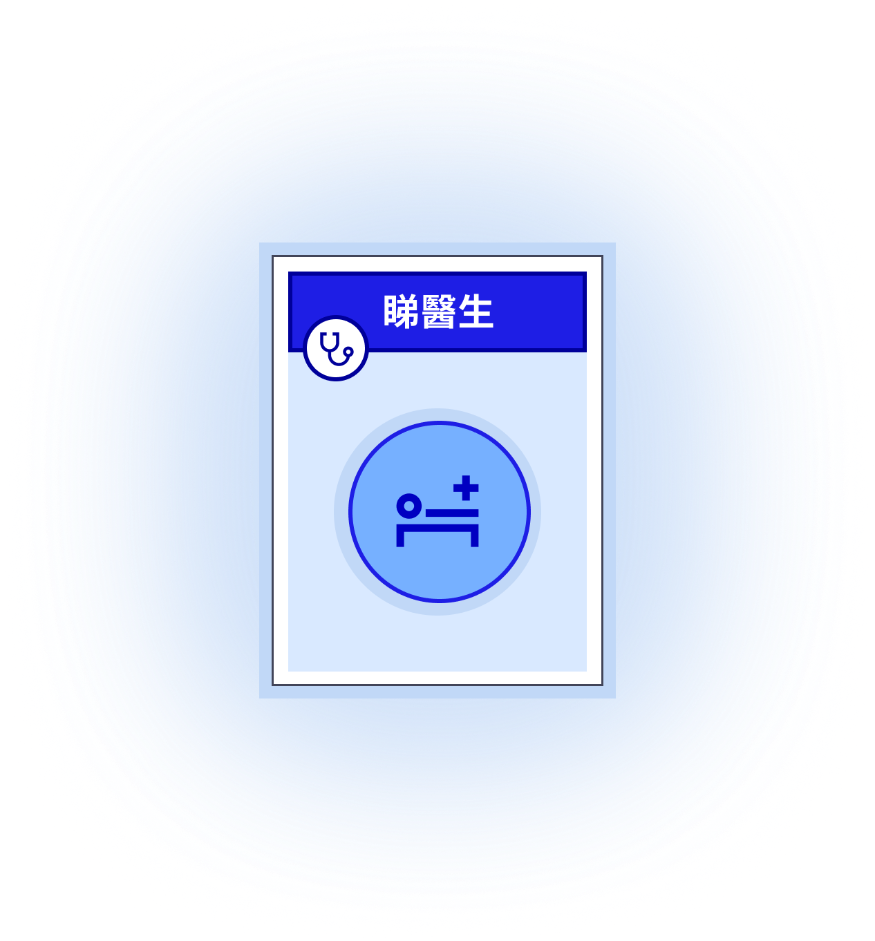
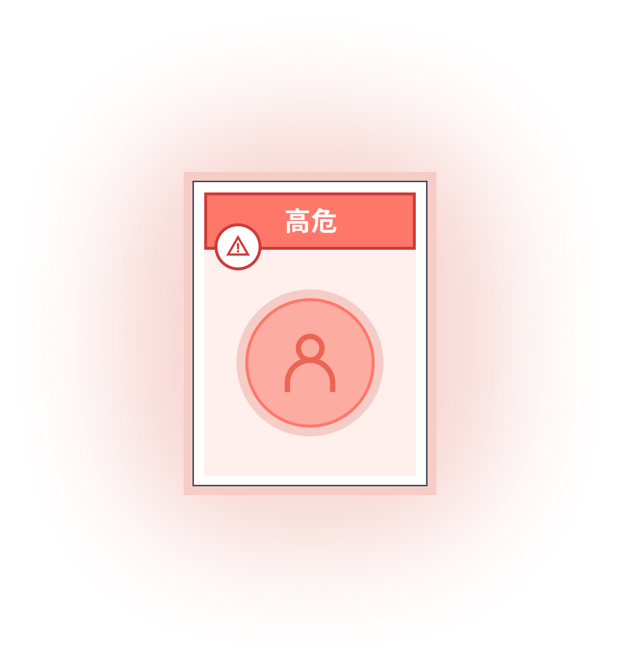
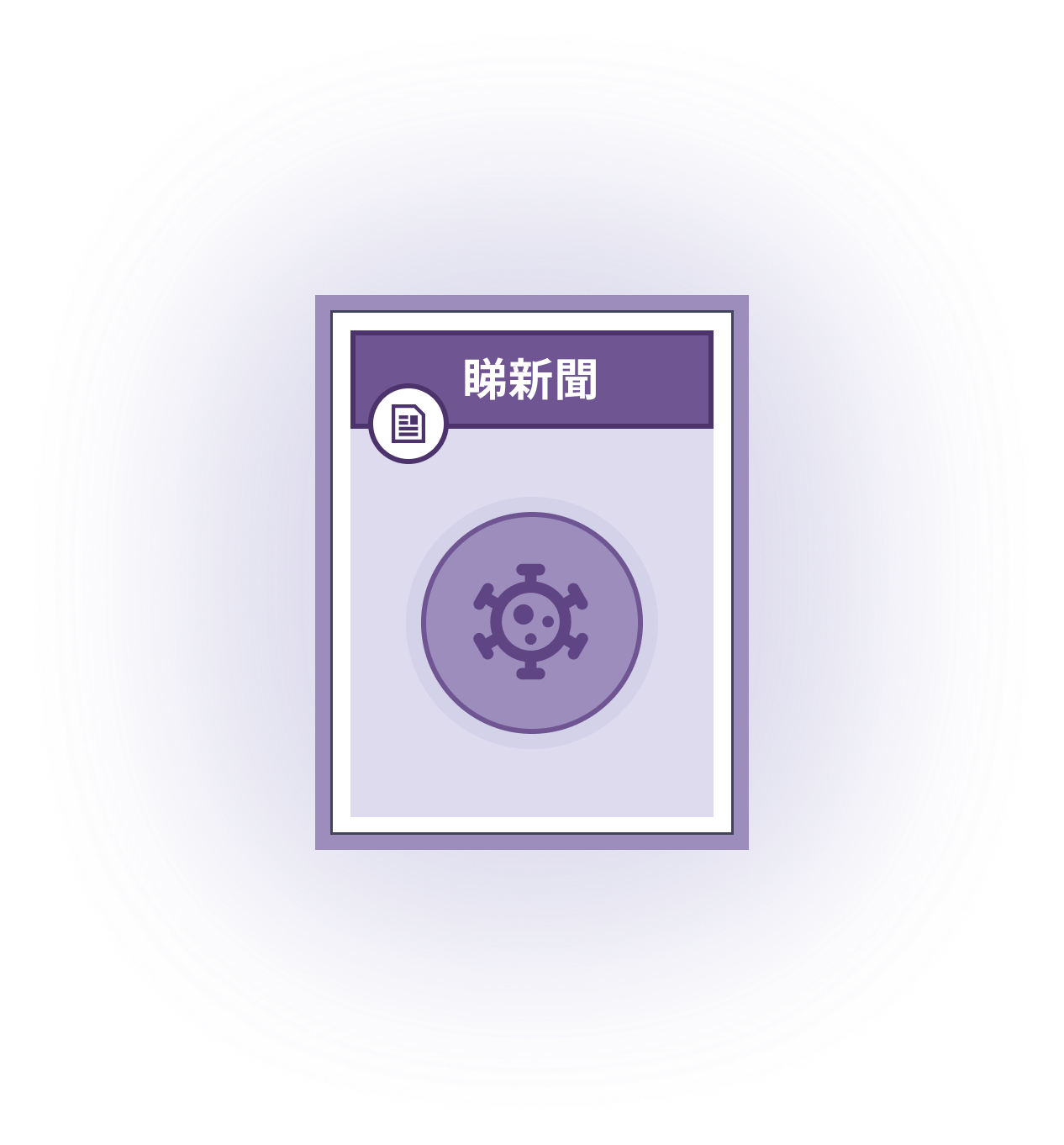
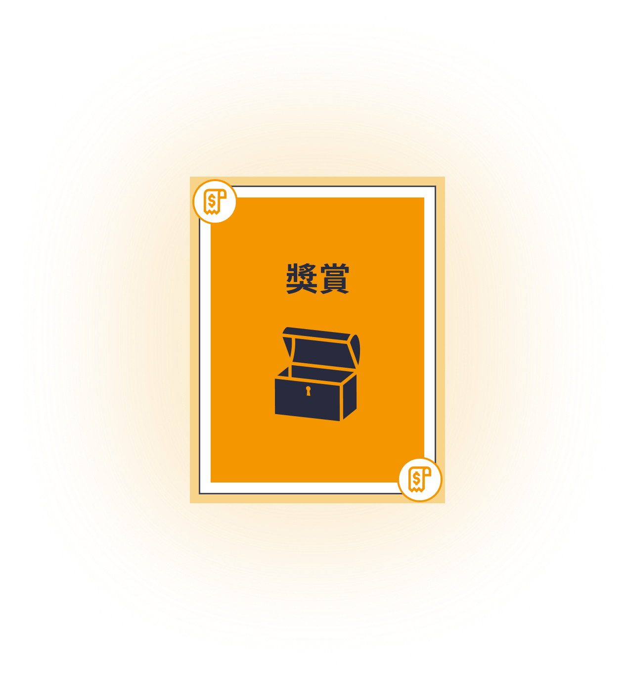
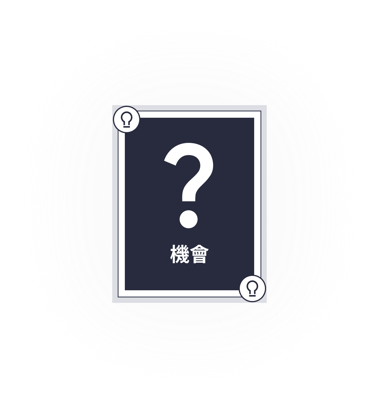
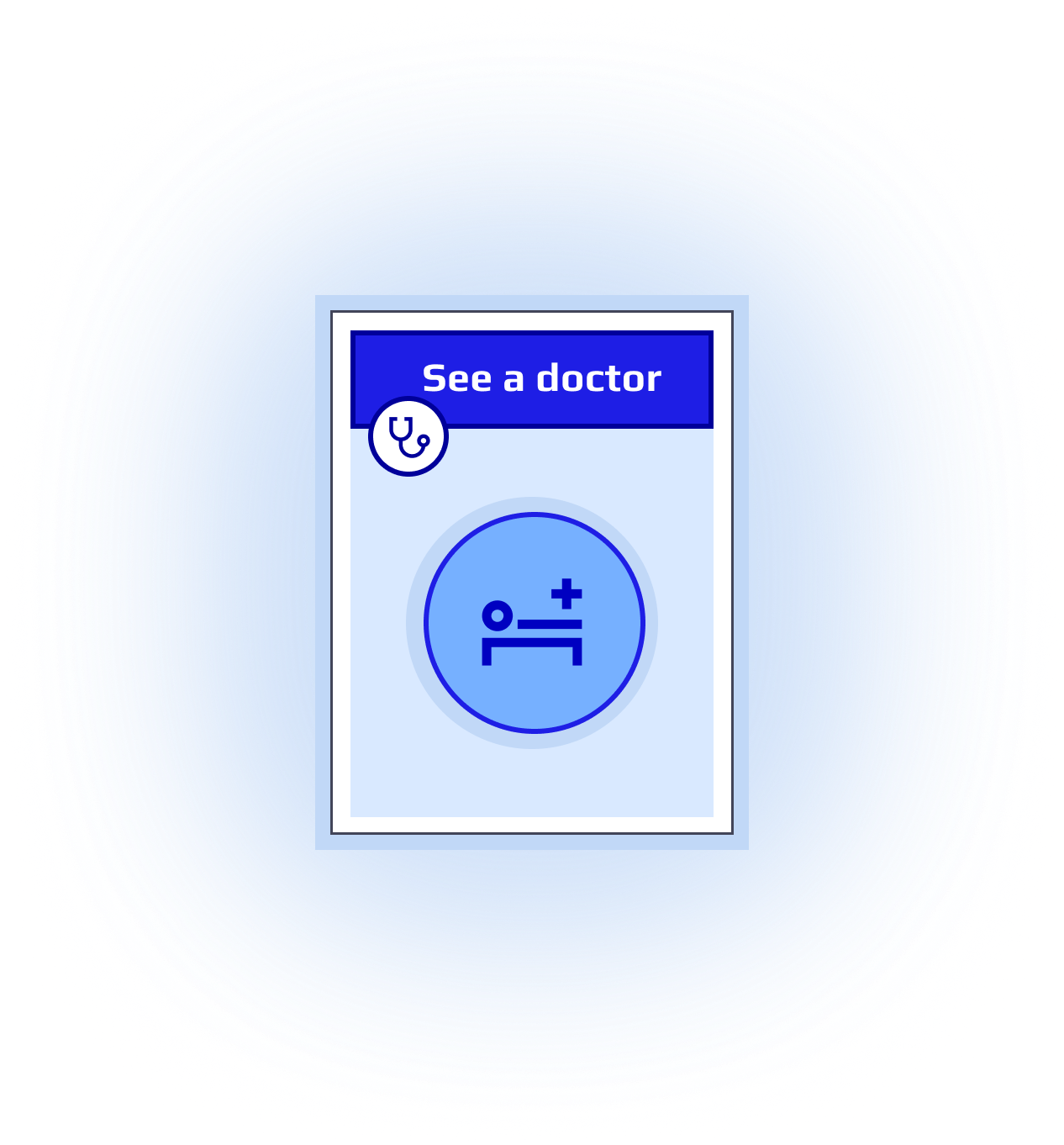
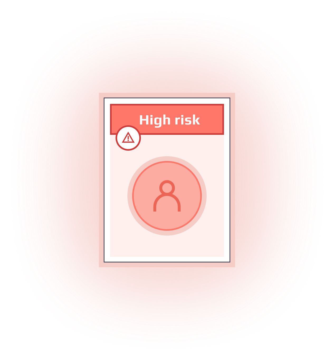
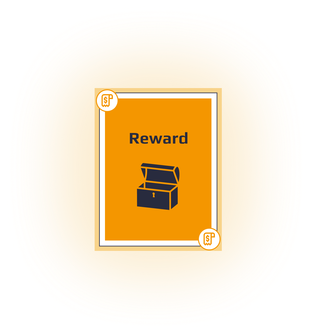
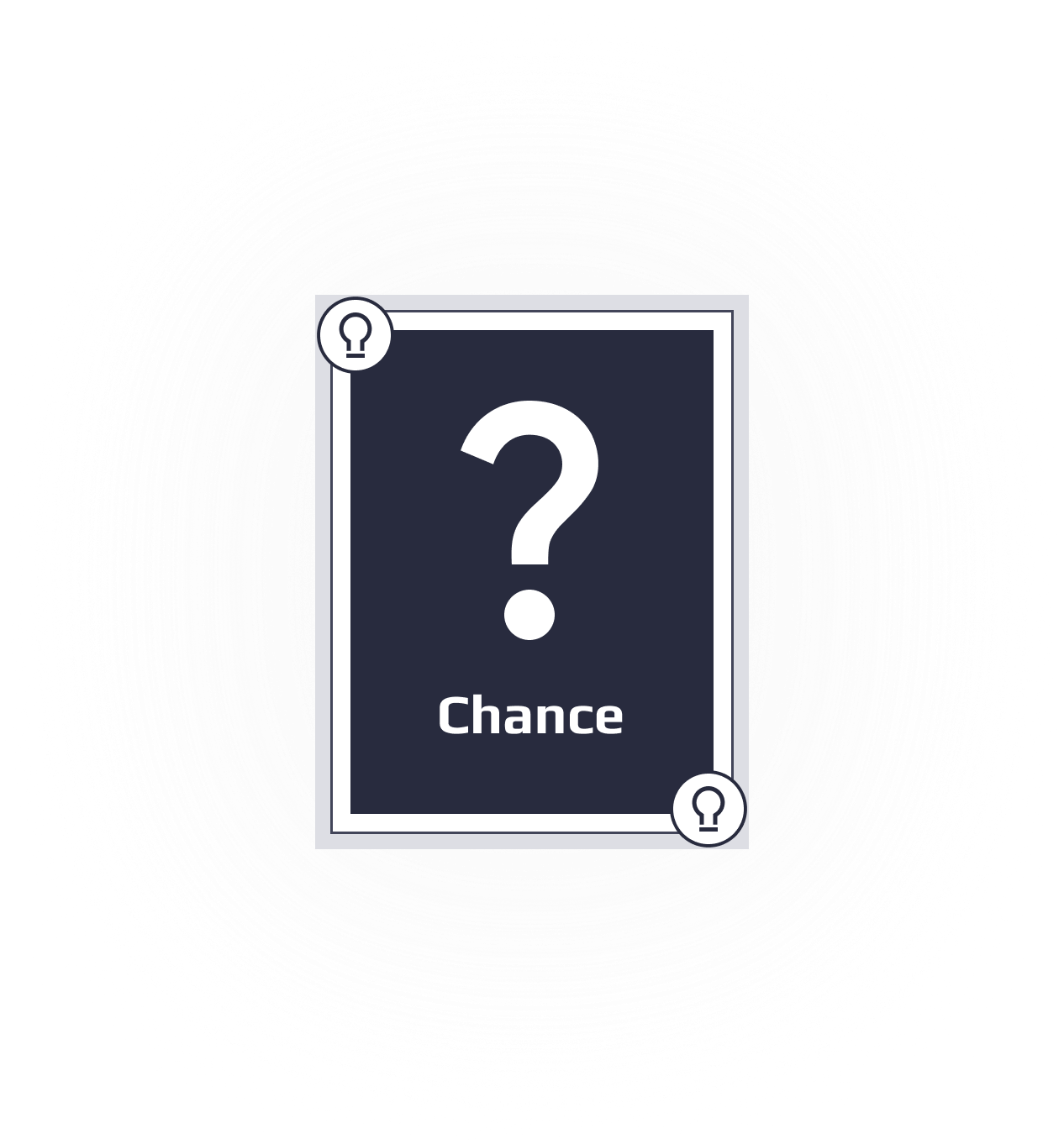
Bilingual key design assets crafted for the game — game board, tagline, playing cards, and custom chess pieces.
GAME TAGLINE
gaming board
chess pieces








cards


Back to top




Claire.C
Case Study · 2025-Q2
Manulife Monopoly Mini Game
CLIENT:
Manulife
YEAR:
2025-Q2
LANGUAGE:
Bilingual
DURATION:
3 weeks
TOOLS:
Figma
Procreate
Overview
A one-off project that was launched for a month at Manulife official website on May 2025. This mini educational game was designed to raise awareness of critical illness and meanwhile targets to attract prospect customers.
Client had clear idea on making a game that refer to the layout of the Monopoly board game in the beginning, and after several rounds of adjustment, it turns from 2D to a fake-3D design. The final design was delivered within 3 weeks under established UX direction.
The Result
35k+
TOTAL REGISTRATION
5.8k+
Total eligible referral case
My Role
I owned the UI end-to-end under a client-set game concept and UX direction. Over three weeks and short sprints, I translated a 2D Monopoly-style brief into a bilingual fake-3D experience — including the isometric board, event cards, and four custom chess pieces illustrated in Procreate — then handed off dev-ready assets in Figma.
The Challenge
Tight turnaround between each design sprint
Turning a flat 2D board into an angular, fake-3D perspective
Scope expanded mid-project: four chess pieces, each from two perspectives,
without slipping the three-week deadline
Process
From sketch to
fake-3D board
Four iterations from the client’s early sketch to the final fake-3D game board — each shaped by feedback, and by a growing scope.
01
Initial conceptual idea from client:
The project began with a simple conceptual direction from client. Early screens featured a minimal interface with the Manulife logo, the challenge title, a prominent “GO” button, and dice as the core interactive element.
Key observations
The game-like experience was driven by chance (dice rolling).
The visual direction was still very basic, with limited hierarchy and almost no board structure.
Brand presence was there, but could be more prominent.
Design decision in this stage
Understanding the user journey (start → roll → progress on a board), and turn a simple dice-rolling mechanic into a more engaging, brand-aligned experience.
02
Layout 1.0
I translated client’s concept into a more structured game board format. The design introduced a recognizable board layout with a central “GO” area, dice rolling interaction, and basic color-coded squares.
Key design decision
Moved from a simple landing screen to an actual board structure to better support game theme.
Established a clear starting point (“GO”) and basic path logic so users could immediately understand how to progress.
Kept the visual language relatively clean and functional at this stage.
Visual richness and character elements were intentionally limited at this stage. The priority was to validate the core game loop and information hierarchy before investing in more detailed illustration and branding.
03
Layout 2.0
This is a significant step forward in both visual density and engagement. The board became more vibrant, with richer iconography and a clearer colour hierarchy of different event types.
Key design decision
Redesigned the board from a rectangle to a square, so it would work better on both desktop and mobile.
Expanded the event squares (rewards, chance, risks, and more).
Strengthened hierarchy through colour, icons, and spatial organisation.
04
New direction from client to final version

Midway through the process, the client introduced a more narrative direction, and asked to turn the 2D board into a fake-3D angular perspective.
Transformation: 2D board → isometric 3D board

Final design decision
Evolved the board into a clean, well-organized square layout with clear event categories and strong visual distinction between square types.
Developed a high-quality 3D isometric illustration of the board. This elevated the overall brand perception and created a memorable, premium visual that could be used for marketing and immersion.
Playfulness balanced with clarity, so the experience stayed easy to understand.
delivery
Final UI
Bilingual UI across tablet and mobile: game board, character select, event cards, and quiz.
demo video
Screen recording
VISUAL CRAFT
UI Highlights
Bilingual key design assets for the game: the board, tagline, playing cards, and custom chess pieces.
GAME TAGLINE
game board
chess pieces
cards
Back to top

