Claire.C

Case Study · 2026-Q1
AIA Health expo -
IHS games
Overview
This project supported AIA’s headline event, Health Expo 2026. It was a major section of the exhibition, designed to promote AIA’s Integrated Healthcare Strategy (IHS) and strengthen relationships between their medical network and corporate partners.
My Role
Under an established structure and a two-week timeline, I designed two visually consistent game interfaces to attract guests and keep them engaged at the event: one informational, and one a competitive scoring game.
The Challenge

Two distinctive games had to feel like one family.
Work within an established structure and a tight on-site schedule.
Make information-heavy content appealing enough for guests to walk up and play.
The Result
1,000+
GUESTS PARTICIPATED
Two distinctive game; one informational game, and one a competitive scoring game.
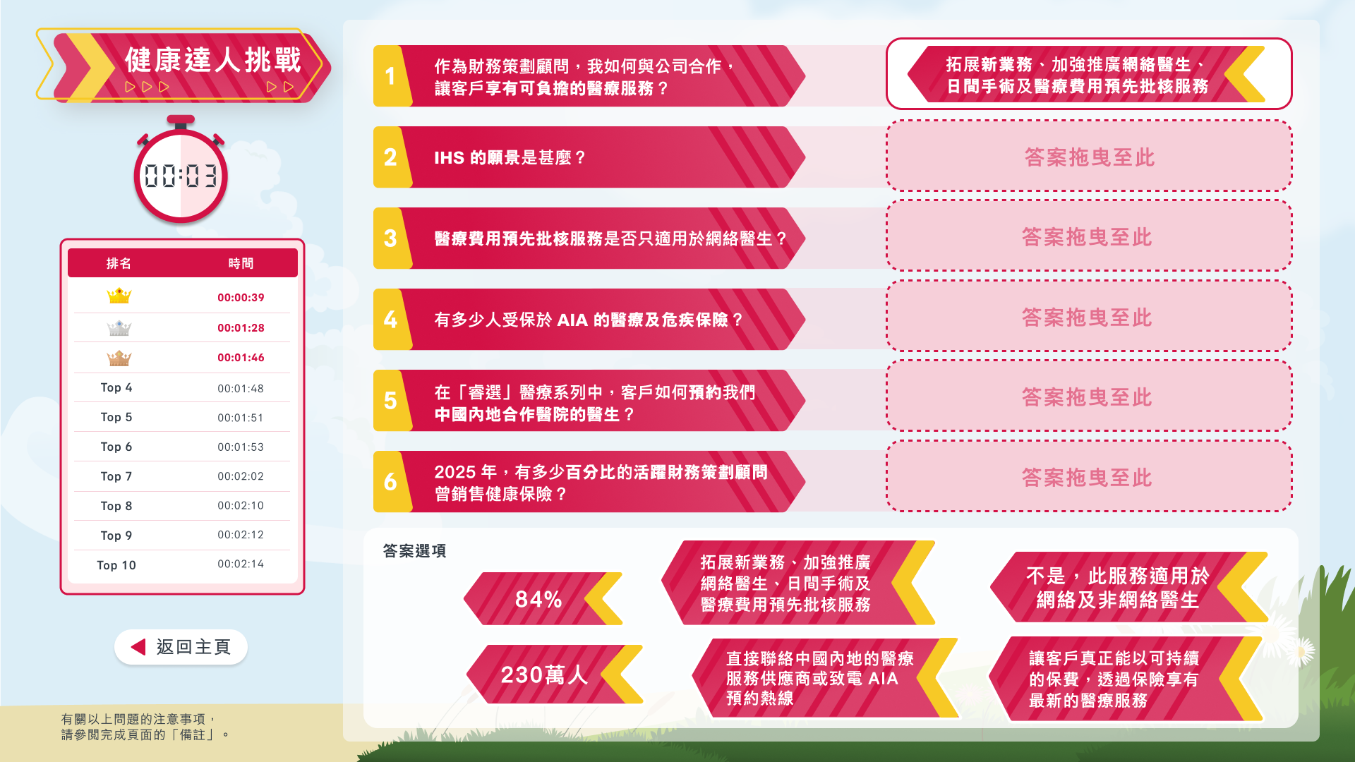
Game 1 - IHS Master Challenge
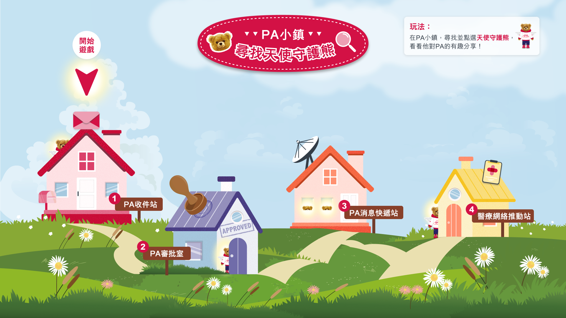
Game 2 - PA Town
game 1
IHS Master Challenge
Showing the most distinctive versions
01
Initial idea from client:
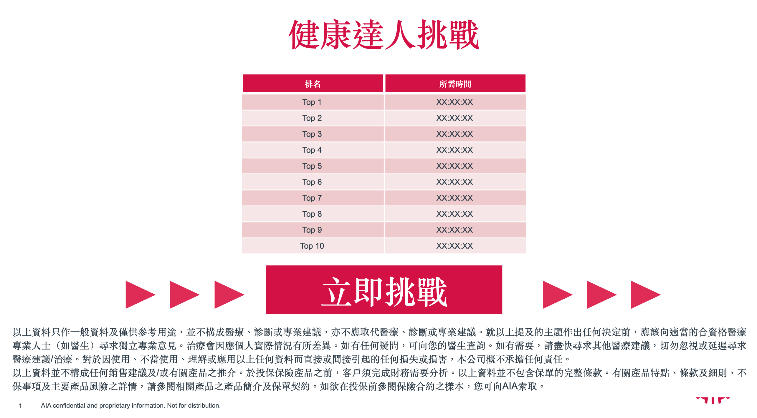
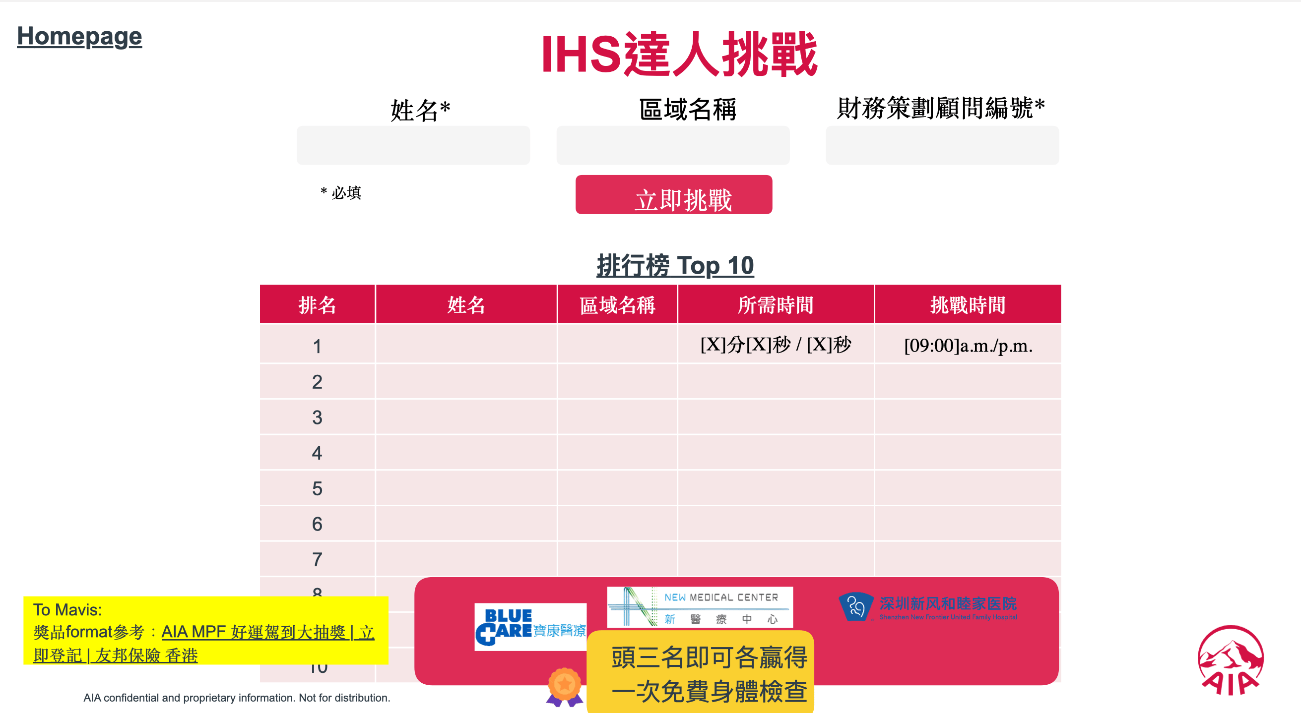
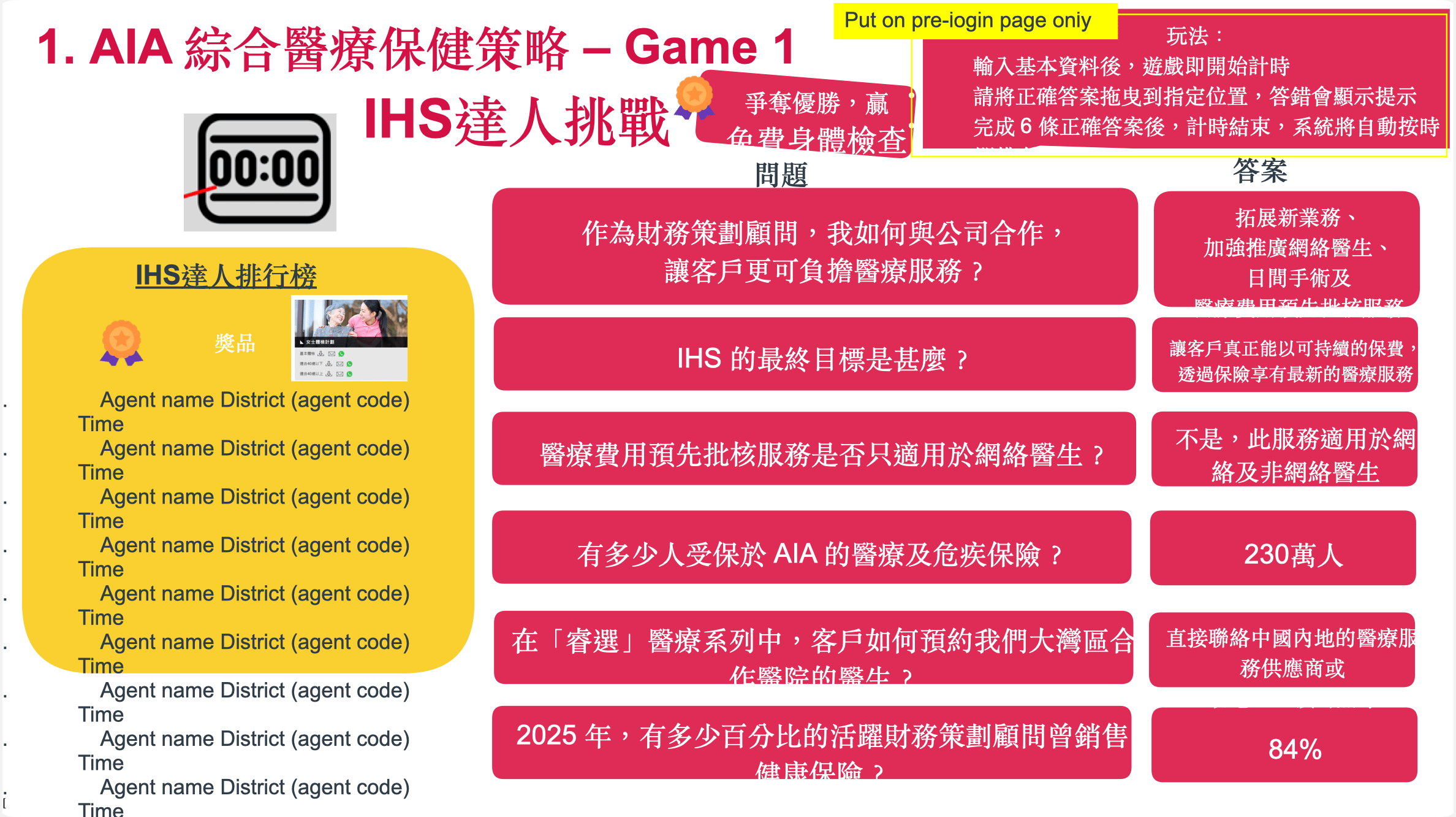
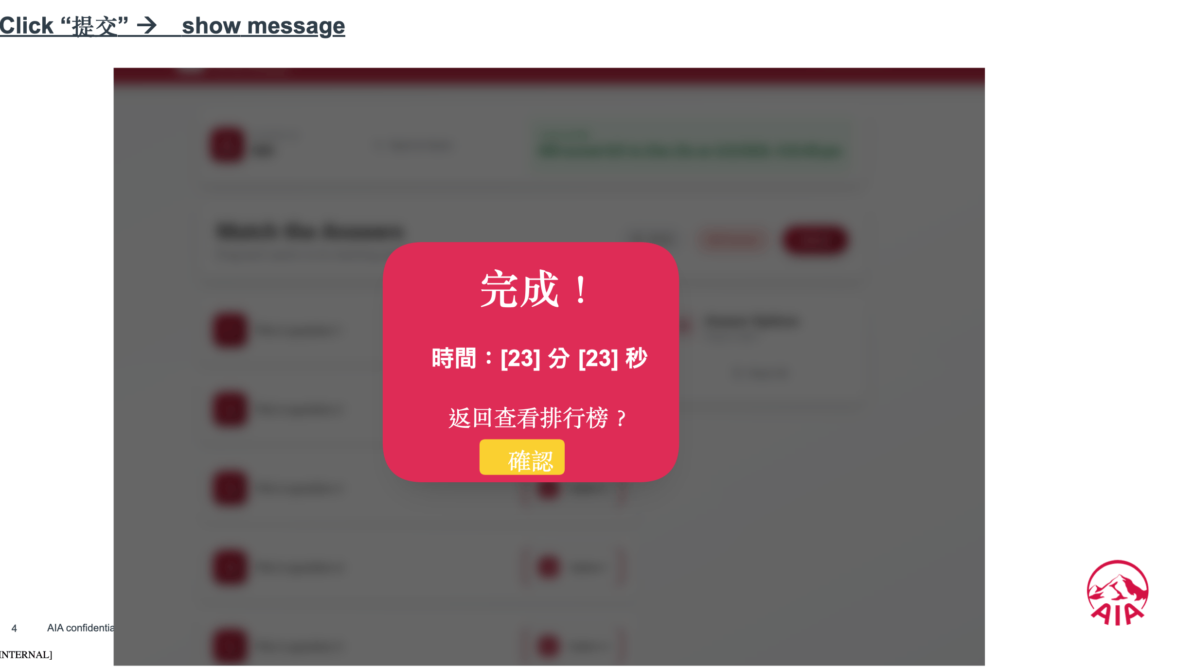
The project began with a set of conceptual screens provided by client. These early materials outlined the core structure of the IHS達人挑戰 (IHS Master Challenge), including:

Ranking leaderboard table
Homepage with name and district input fields
A series of quiz-style question cards
Completion modal displaying time and score
Key observations
The content focused on AIA’s comprehensive medical and health strategy, and tested agents’ knowledge. At this stage, The early screens were still highly informational and lacked a cohesive visual system, a clear interaction hierarchy, and refined user flow. The primary goal of this phase was to understand the business requirements, content structure, and intended user-flow:
Registration

Answering questions
Viewing results and ranking
02
Layout 1.0
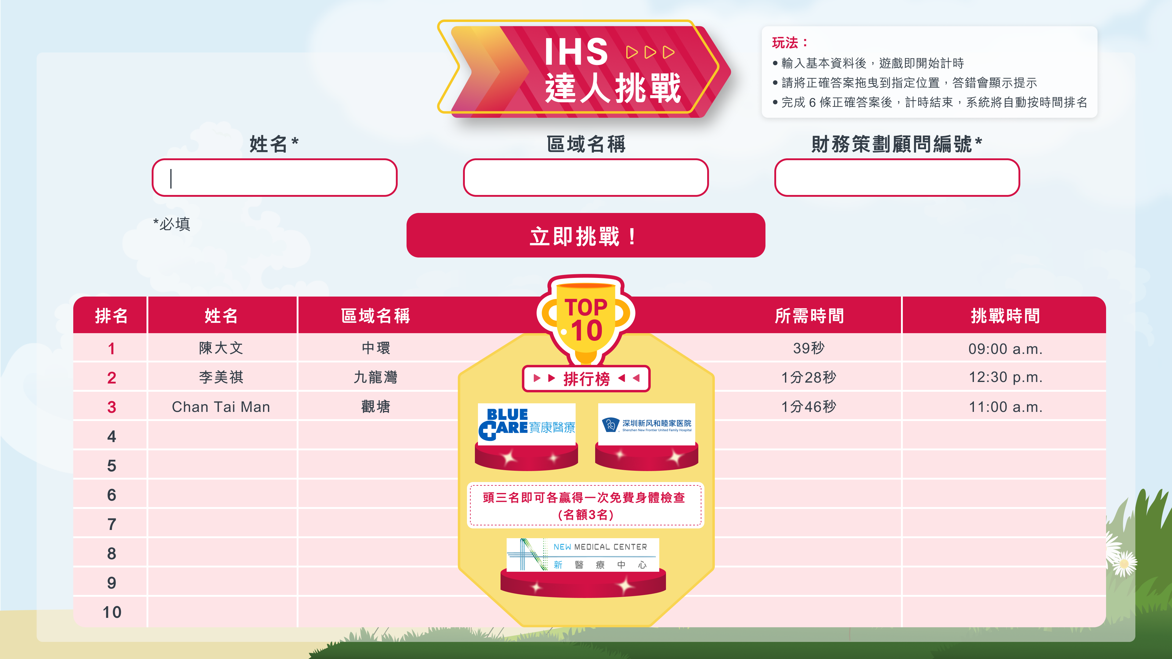
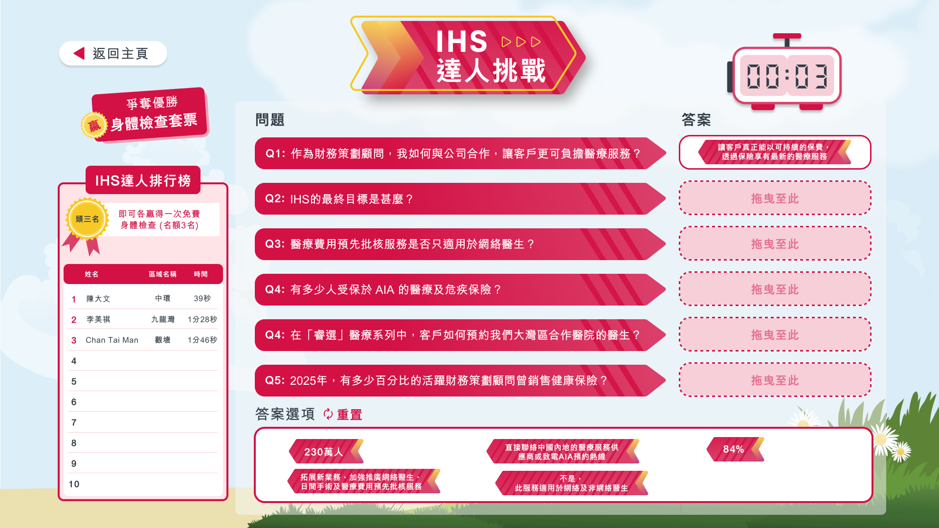
Design decisions and rationale
In the first structured layout, I translated client’s conceptual idea into a more defined interface framework. Key developments include:
Clearer information architecture for input, leaderboard, and quiz.
A timer to support the competitive format Sequential, card-based questions.
Early hierarchy through colour coding and dividers.
This version focused on functional clarity and basic usability. The visual language was still relatively flat, and brand elements were limited.
03
Final version
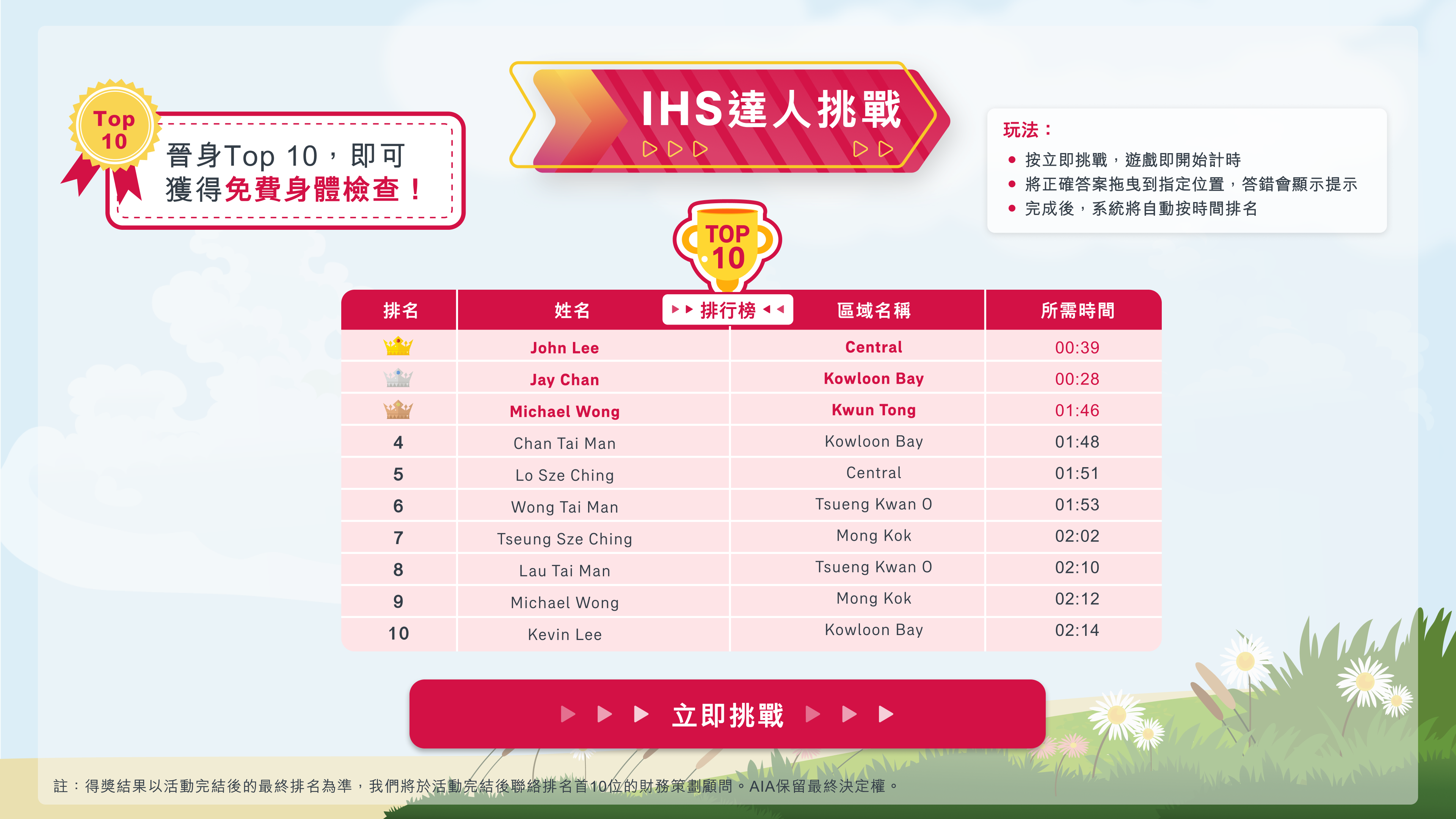
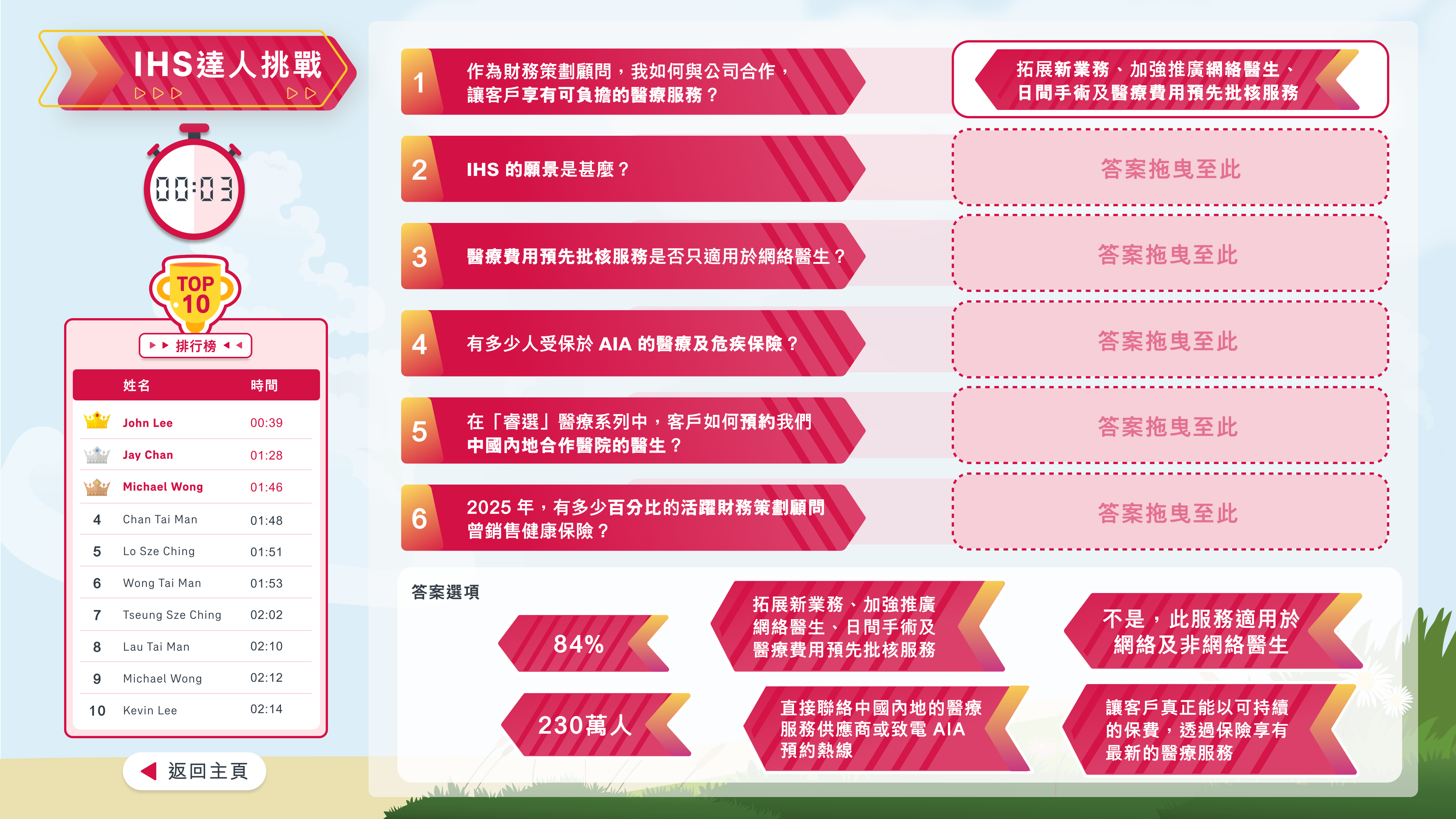
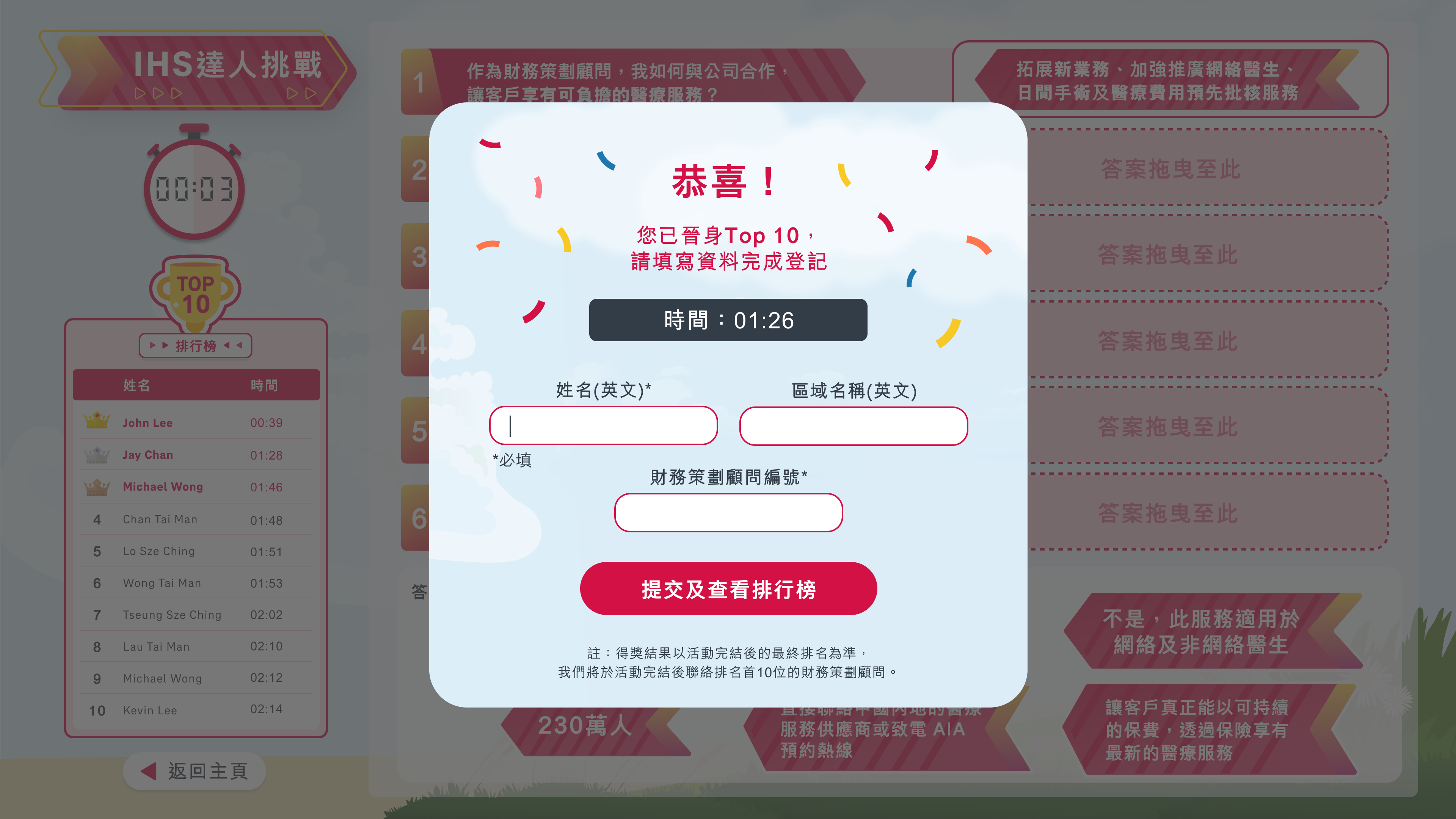
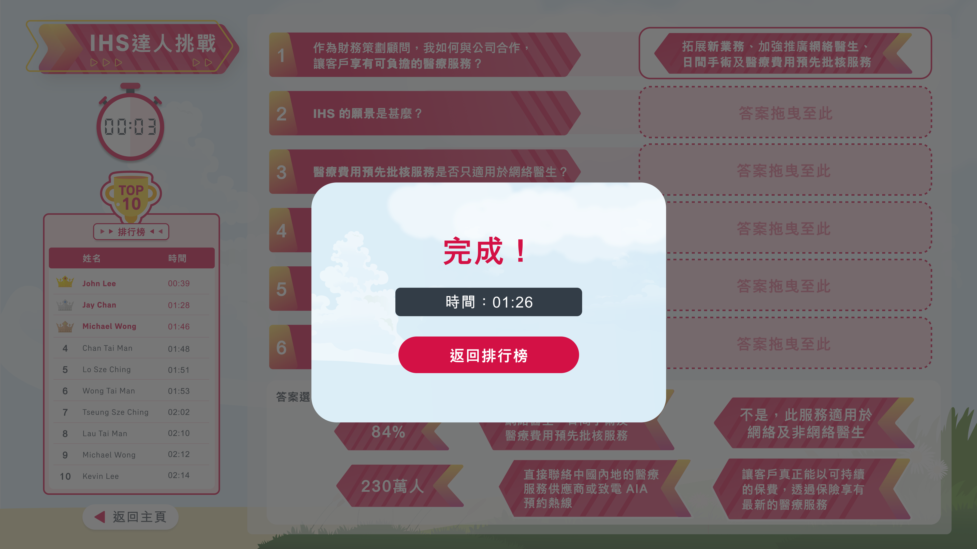
Design decisions and rationale
The final design refined both the visual system and interaction experience. Major improvements included:
Visual identity
Consistent red-and-white colour scheme aligned with AIA branding, along with cleaner typography, iconography, and subtle decorative elements.
Leaderboard enhancement
Redesigned the ranking table with clearer hierarchy, medals for top positions, and improved readability.
Quiz experience
Better spacing, clearer answers, and a more engaging sense of progress.
Completion states
Strengthened success moments through celebratory modals (“恭喜!” / “完成!”), clear time display, and actionable next steps.
Overall polish
Improved spacing, alignment, and micro-interactions to create a more premium and motivating experience for users
The final version turned the original concept into a cohesive, brand-aligned challenge that balances competition, learning, and recognition.
game 2
PA Town
Showing the most distinctive versions
01
Initial conceptual idea from client:
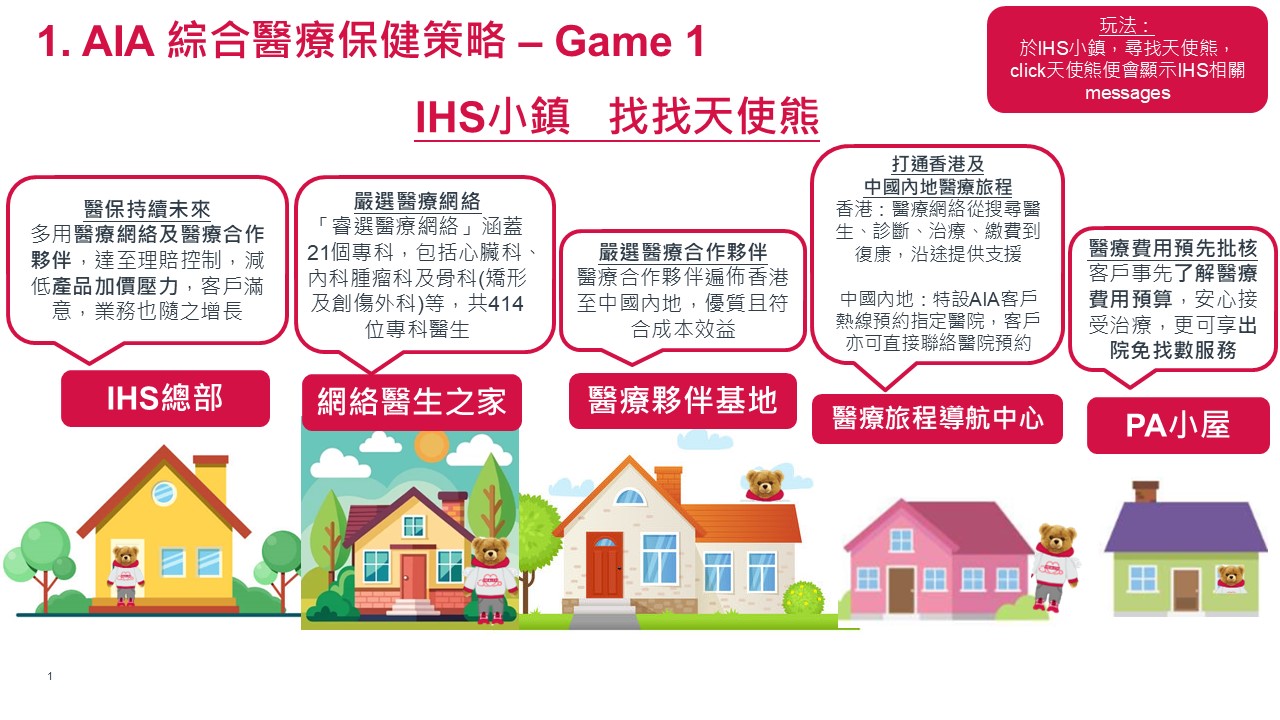
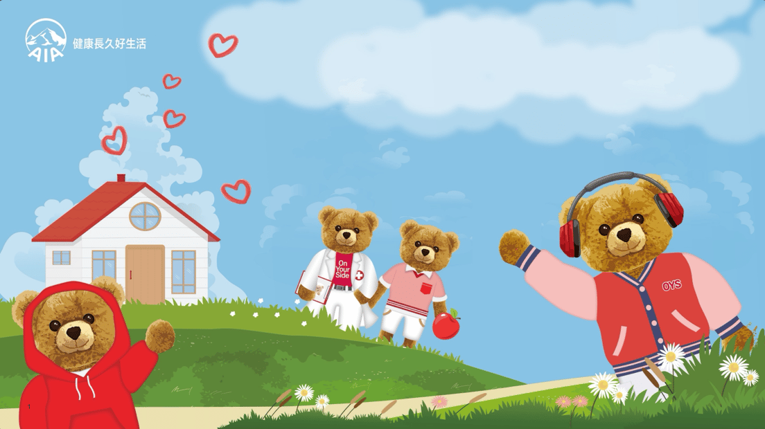
In terms of this static click and show game, the early materials included a diagram of functional zones as houses, and a cheerful illustrated scene with teddy-bear characters in a small town.
Key observations
I treated these materials as a creative brief rather than a fixed design. The tone was playful, warm, and educational, with a “find the angel bear” mechanic to guide users through PA-related information.
02
Layout 1.0
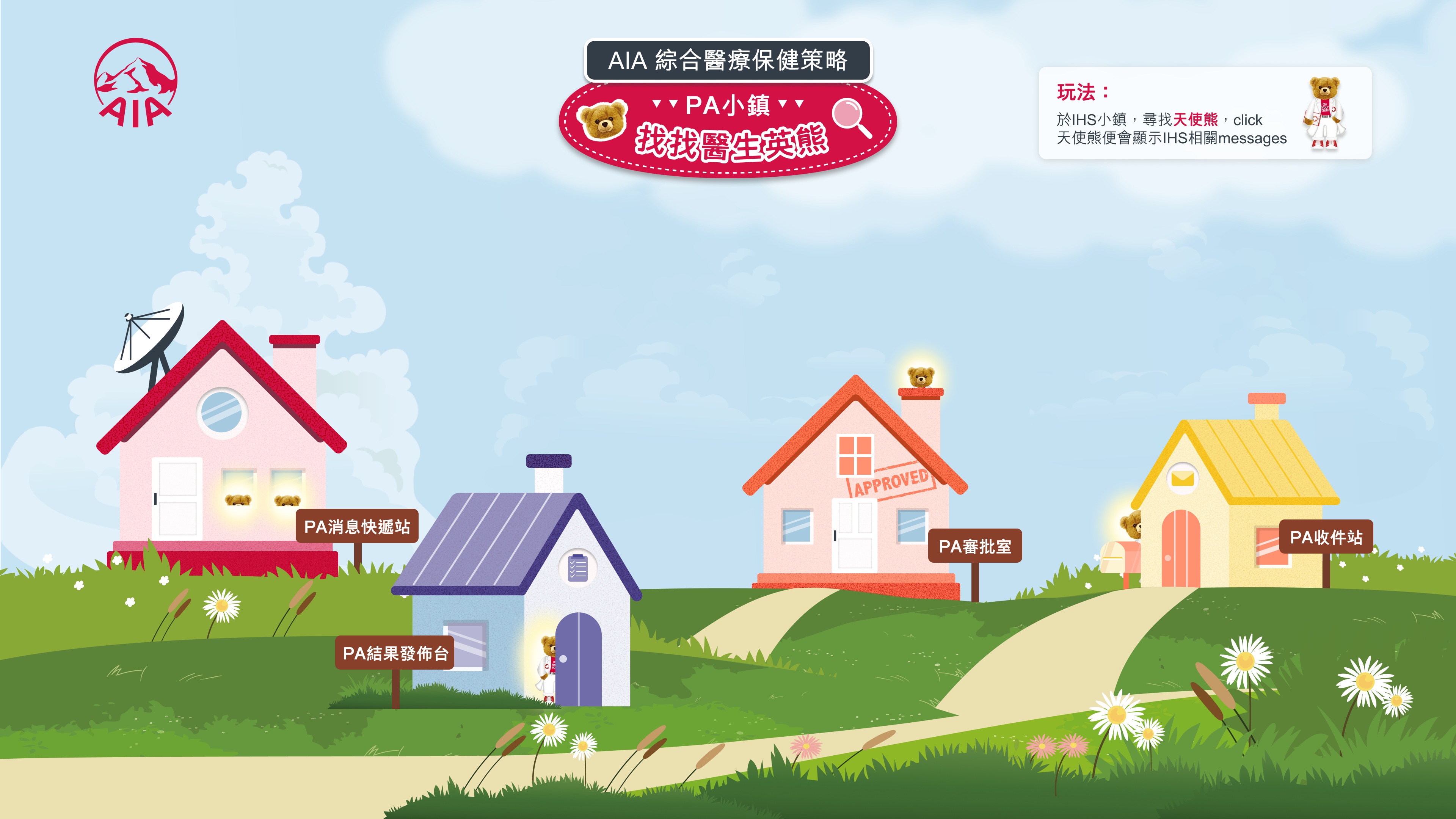
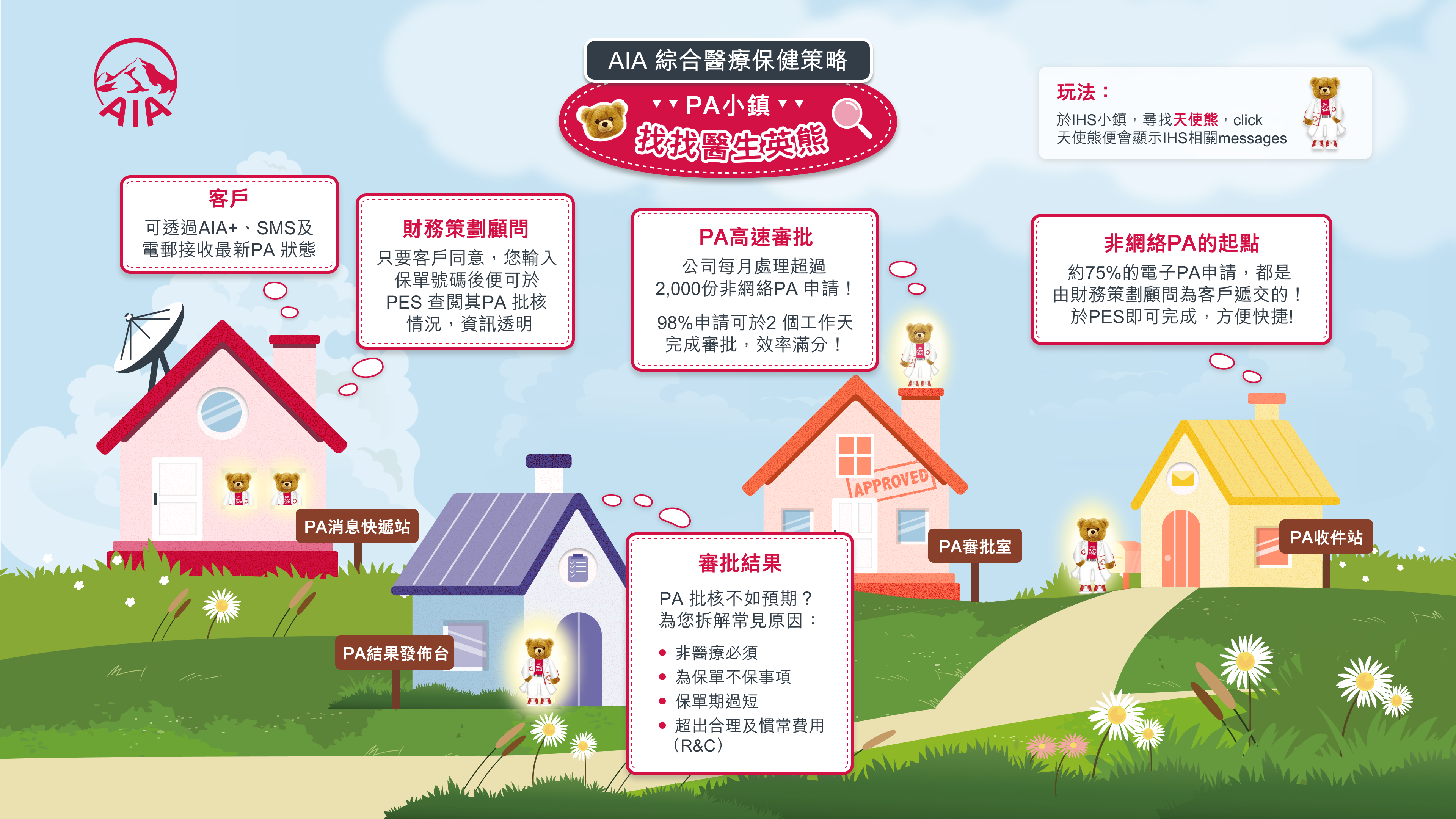
In Layout 1.0, I turned client’s concept into a clearer spatial structure. The design organized the experience around a series of houses placed along a path on a green hill, each representing a different PA function.
Design decisions and rationale
Spatial storytelling:
Arranged the houses in a sequential path to create a sense of journey, helping users intuitively understand that they are progressing through different stages of the PA process.
Clear labeling
Added direct labels under each house so users could immediately identify the purpose of each station without relying solely on illustration.
Balanced composition
Positioned the houses with enough breathing room and visual rhythm to avoid clutter while maintaining a cohesive “town” feeling.
Preserved character warmth
Kept the overall illustrative style soft and friendly to stay aligned with the original emotional direction.
03
Final version
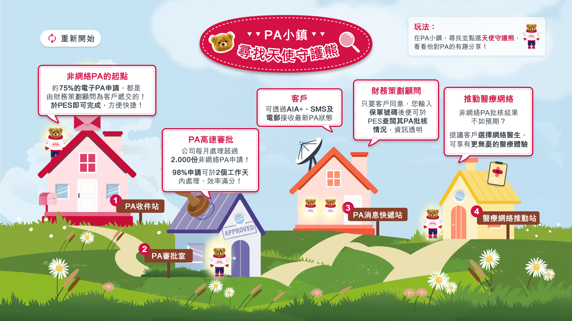
The final version refined both the visual clarity and the informational guidance of the experience.
Improved user-flow:
Added a clear “開始遊戲” (Start Game) entry point and refined the path so the user journey feels more intentional.
Visual polish and consistency
Tightened spacing, refined house details, and strengthened the overall color harmony while keeping the warm, approachable illustration style.
delivery
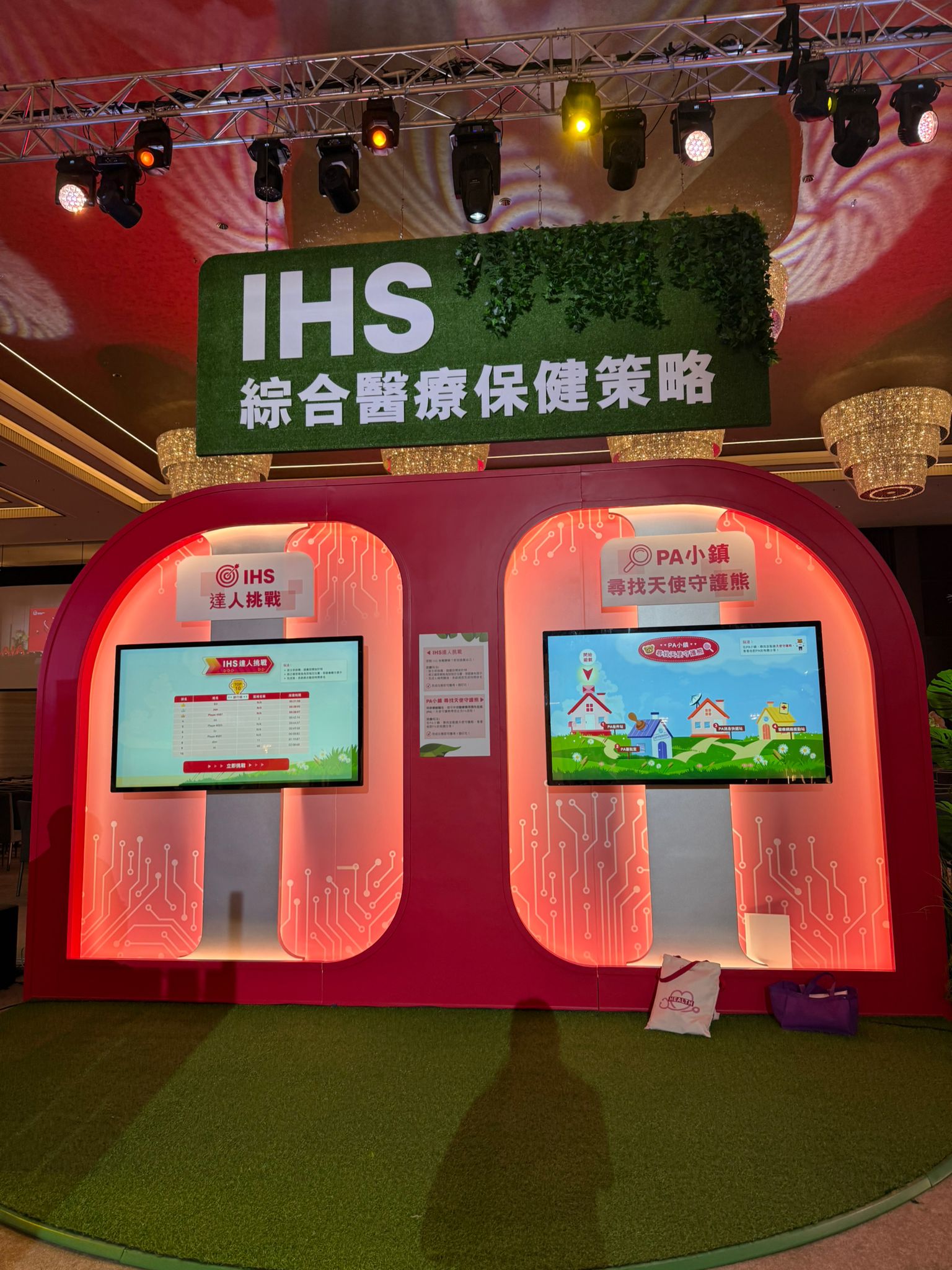
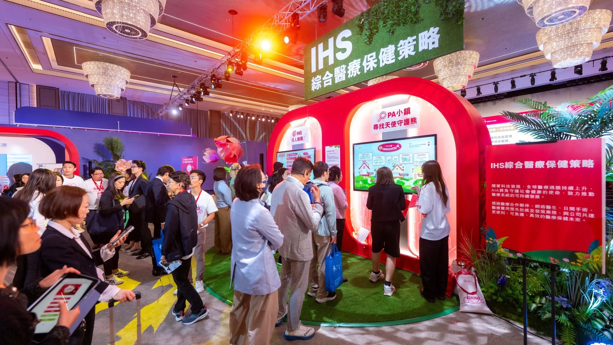
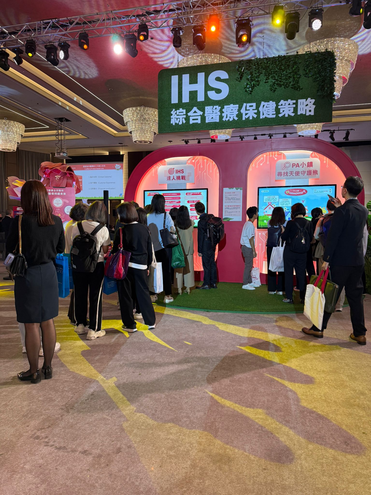
On-site photos
AIA Health Expo 2026
game 1 & 2
UI Highlights
game 1

ASSETS


game 2
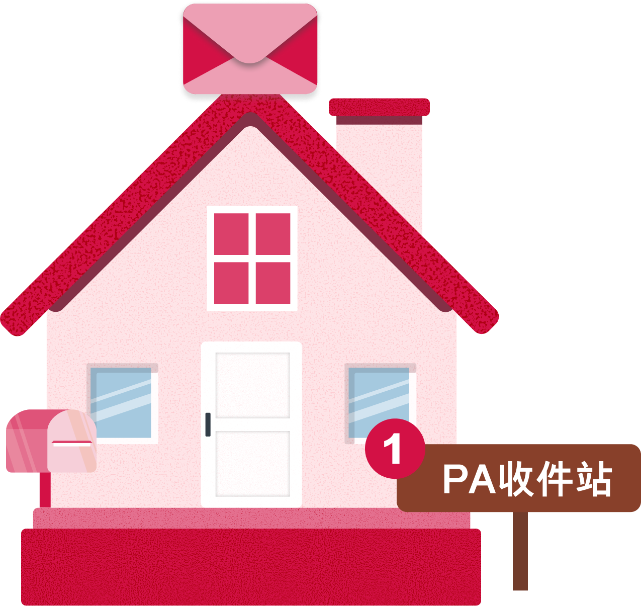
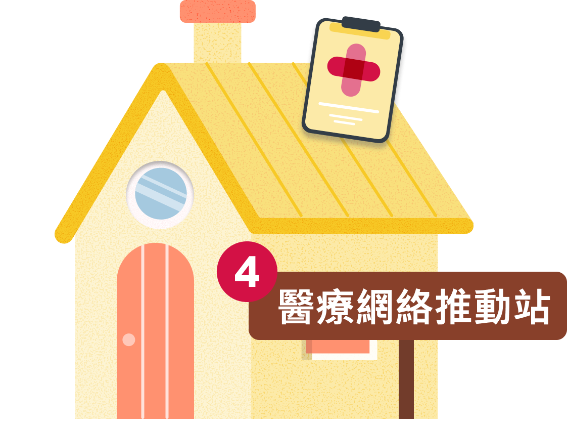
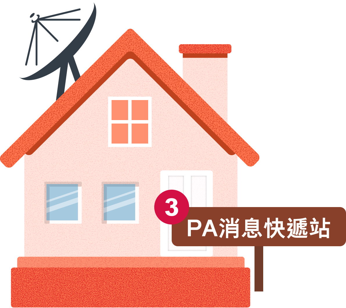
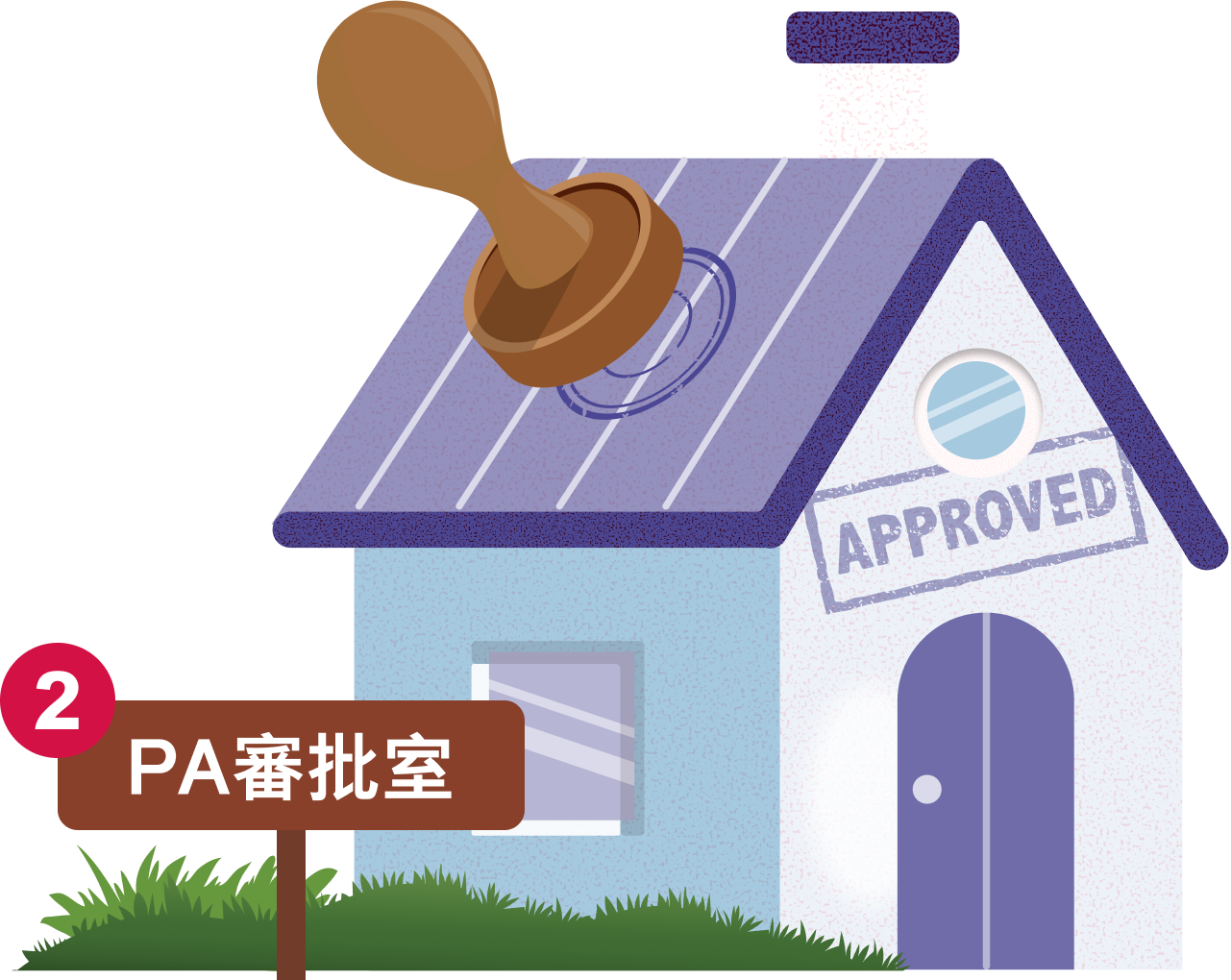
PA STATIONS

Back to top




Claire.C
Case Study · 2026-Q1
AIA Health Expo 2026 - IHS games
CLIENT:
AIA
YEAR:
2026-Q1
LANGUAGE:
Chinese
DURATION:
2 weeks
TOOLS:
Figma
Overview
This project supported AIA’s headline event, Health Expo 2026. It was a major section of the exhibition, designed to promote AIA’s Integrated Healthcare Strategy (IHS) and strengthen relationships between their medical network and corporate partners.
My Role
Under an established structure and a two-week timeline, I designed two visually consistent game interfaces to attract guests and keep them engaged at the event: one informational, and one a competitive scoring game.
The Challenge
Two distinctive games had to feel like one family.
Work within an established structure and a tight on-site schedule.
Make information-heavy content appealing enough for guests to walk up and play.
The Challenge
Two distinctive games had to feel like one family.
Work within an established structure and a tight on-site schedule.
Make information-heavy content appealing enough for guests to walk up and play.
The Result
1,000+
GUESTS PARTICIPATED
Two distinctive game; one informational game, and one a competitive scoring game.
Game 1 - IHS Master Challenge
Game 2 - PA Town
game 1
IHS Master Challenge
Showing the most distinctive versions
01
Initial idea from client:
The project began with a set of conceptual screens provided by client. These early materials outlined the core structure of the IHS達人挑戰 (IHS Master Challenge), including:
Ranking leaderboard table
Homepage with name and district input fields
A series of quiz-style question cards
Completion modal displaying time and score
Key observations
The content focused on AIA’s comprehensive medical and health strategy, and tested agents’ knowledge. At this stage, The early screens were still highly informational and lacked a cohesive visual system, a clear interaction hierarchy, and refined user flow. The primary goal of this phase was to understand the business requirements, content structure, and intended user-flow:
Registration

Answering questions
Viewing results and ranking
02
Layout 1.0
Design decisions and rationale
In the first structured layout, I translated client’s conceptual idea into a more defined interface framework. Key developments include:
Clearer information architecture for input, leaderboard, and quiz.
A timer to support the competitive format Sequential, card-based questions.
Early hierarchy through colour coding and dividers.
This version focused on functional clarity and basic usability. The visual language was still relatively flat, and brand elements were limited.
03
Final version
Design decisions and rationale
The final design refined both the visual system and interaction experience.
Major improvements included:
Visual identity:
Consistent red-and-white colour scheme aligned with AIA branding, along with cleaner typography, iconography, and subtle decorative elements.
Leaderboard enhancement:
Redesigned the ranking table with clearer hierarchy, medals for top positions, and improved readability.
Quiz experience:
Better spacing, clearer answers, and a more engaging sense of progress.
Completion states:
Strengthened success moments through celebratory modals (“恭喜!” / “完成!”), clear time display, and actionable next steps.
Overall polish
Improved spacing, alignment, and micro-interactions to create a more premium and motivating experience for users
The final version turned the original concept into a cohesive, brand-aligned challenge that balances competition, learning, and recognition.
game 2
PA Town
Showing the most distinctive versions
01
Initial conceptual idea from client:
In terms of this static click and show game, the early materials included a diagram of functional zones as houses, and a cheerful illustrated scene with teddy-bear characters in a small town.
Key observations
I treated these materials as a creative brief rather than a fixed design. The tone was playful, warm, and educational, with a “find the angel bear” mechanic to guide users through PA-related information.
02
Layout 1.0
In Layout 1.0, I turned client’s concept into a clearer spatial structure. The design organized the experience around a series of houses placed along a path on a green hill, each representing a different PA function.
Design decisions and rationale:
Spatial storytelling
Arranged the houses in a sequential path to create a sense of journey, helping users intuitively understand that they are progressing through different stages of the PA process.
Clear labeling
Added direct labels under each house so users could immediately identify the purpose of each station without relying solely on illustration.
Balanced composition
Positioned the houses with enough breathing room and visual rhythm to avoid clutter while maintaining a cohesive “town” feeling.
Preserved character warmth
Kept the overall illustrative style soft and friendly to stay aligned with the original emotional direction.
03
Final version
The final version refined both the visual clarity and the informational guidance of the experience.
Improved user-flow
Added a clear “開始遊戲” (Start Game) entry point and refined the path so the user journey feels more intentional
Visual polish and consistency
Tightened spacing, refined house details, and strengthened the overall color harmony while keeping the warm, approachable illustration style.
delivery
On-site photos
AIA Health Expo 2026
game 1 & 2
UI Highlights
game 1
ASSETS
game 2
PA STATIONS
Back to top

